Muse tickets
“Reimagining the museum experience before, during, and after the visit all in one place.”

06 Measuring Success
07 Next Steps
Since the app has not been released to the public, current success was measured by how effectively participants completed key tasks in testing. Every user was able to browse, filter, and book with ease, offering positive feedback about navigation and layout. However, this is only a starting point. Future iterations should include quantitative metrics, larger user pools, and real-world scenarios to get a more accurate picture of performance and impact.
The next phase involves releasing the platform to a broader audience and gathering real-world feedback. Post-launch, I plan to monitor usage data, identify usability issues, and enhance key features based on behavioural insights. Continuous design iteration will be at the core of this process, ensuring the platform remains useful, usable, and relevant over time.
05 Final UI
Rijksmuseum
Meet the Traveller
Improving Amelia’s user journey
Learning from competition
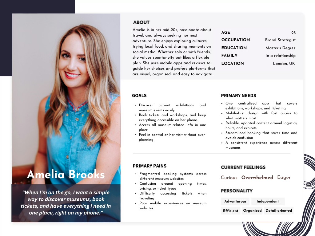
Before I got into wireframes and flows, I needed to figure out who I was really designing for. I built user personas based on research and user behaviours, fictional characters that made it easier to empathize with the end user. These helped bring clarity to the process and turned broad challenges into specific needs. One persona, in particular, stood out and shaped many of the choices I made.
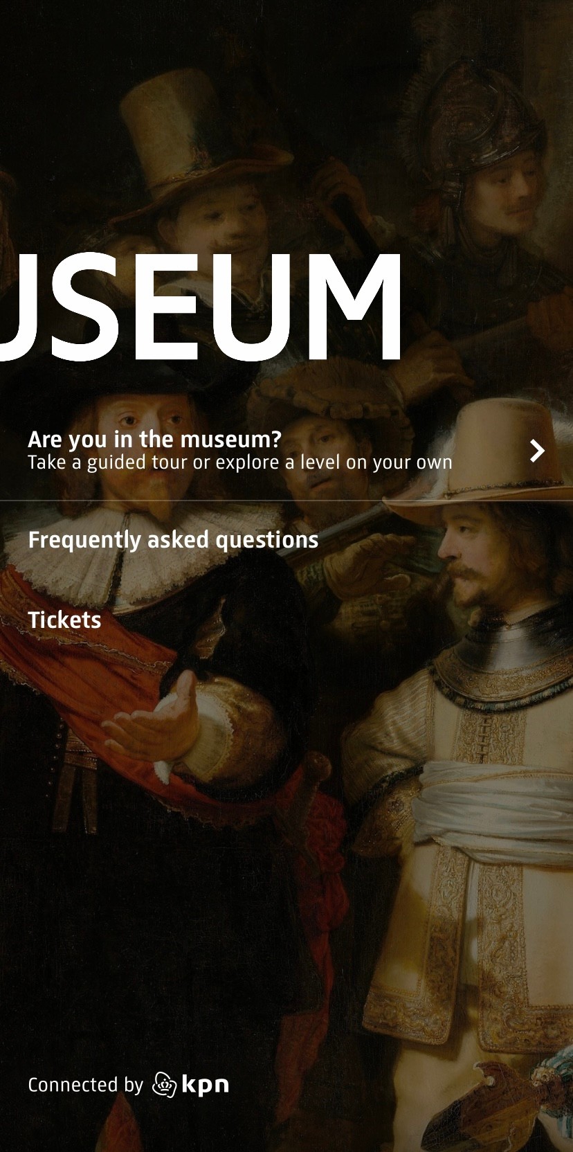
When researching mobile experiences in the museum space, I quickly realised how few institutions offer a dedicated app. While some museums provide web-based tools or audio guides, there’s no consistent mobile solution for planning visits, booking tickets, and accessing exhibits. This absence revealed a clear opportunity: to create a centralised, mobile-first app that serves as a reliable companion for museum-goers.
With a clearer understanding of the issues travellers face, I was able to define how the visitor journey could be improved. I laid out the existing process, where visitors often jump between fragmented websites and booking systems, and envisioned a more seamless, mobile-first future state that could solve these key pain points.
To see how real users interacted with my first design iteration, I set up usability testing using a Figma prototype. Participants were primarily from my personal network due to time and resource constraints, yet their input helped highlight what was working and what needed improvement. My main testing goals were:
The test results confirmed that the app’s navigation and booking process had improved notably, but a few pain points remained. The original booking button was flagged as too wordy, and users found it difficult to distinguish between core pages. While adding filters was already part of the broader product vision, testing validated that this feature was more critical than anticipated. As a result, filters were added and structural tweaks were made to better communicate which part of the app users were in.
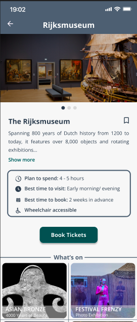
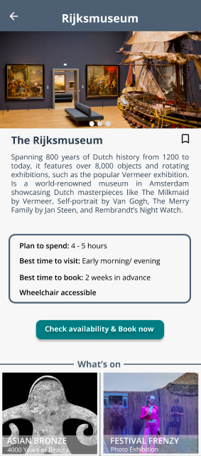
Users consistently pointed out that the original “Check availability & Book now” button felt too wordy and cluttered the screen. A major focus of this redesign was reducing cognitive load and making core actions feel more approachable. Streamlining it to “Book Tickets” helped improve scannability and reduced hesitation. This small change aligned with a larger objective of making the booking journey smoother and more focused on action. The new “Book Tickets” button not only offers a clearer call to action but also features improved contrast for better legibility, meeting WCAG accessibility standards. Alongside shortening the button label, spacing was refined and icons were added to improve scannability and support a more visually accessible experience.
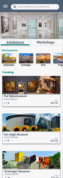
Many users expressed that the homepage and exhibition views felt too similar, making navigation unintuitive. By redesigning the layout with more distinct tab styling and applying clear filters just below the navigation bar, users gained better context and control when browsing. These enhancements were a direct response to both user confusion and visual hierarchy gaps.
Existing
Searches online for museum options
Switches between multiple websites
Looks up dates and times separately
Faces different booking flows per museum
Receives tickets via email or screenshots
Struggles to keep track of bookings
Desirable future
Opens the app
Explores all exhibitions in one place
Sees clear dates, times, and ticket options
Books tickets directly in-app
Stores and manages tickets within the app
Views and organises visit details easily
02 Define
03 Design
Fragmented experience, inconsistent processes, extra effort required
One platform, clear flow, minimal cognitive load
Flow & Continuity
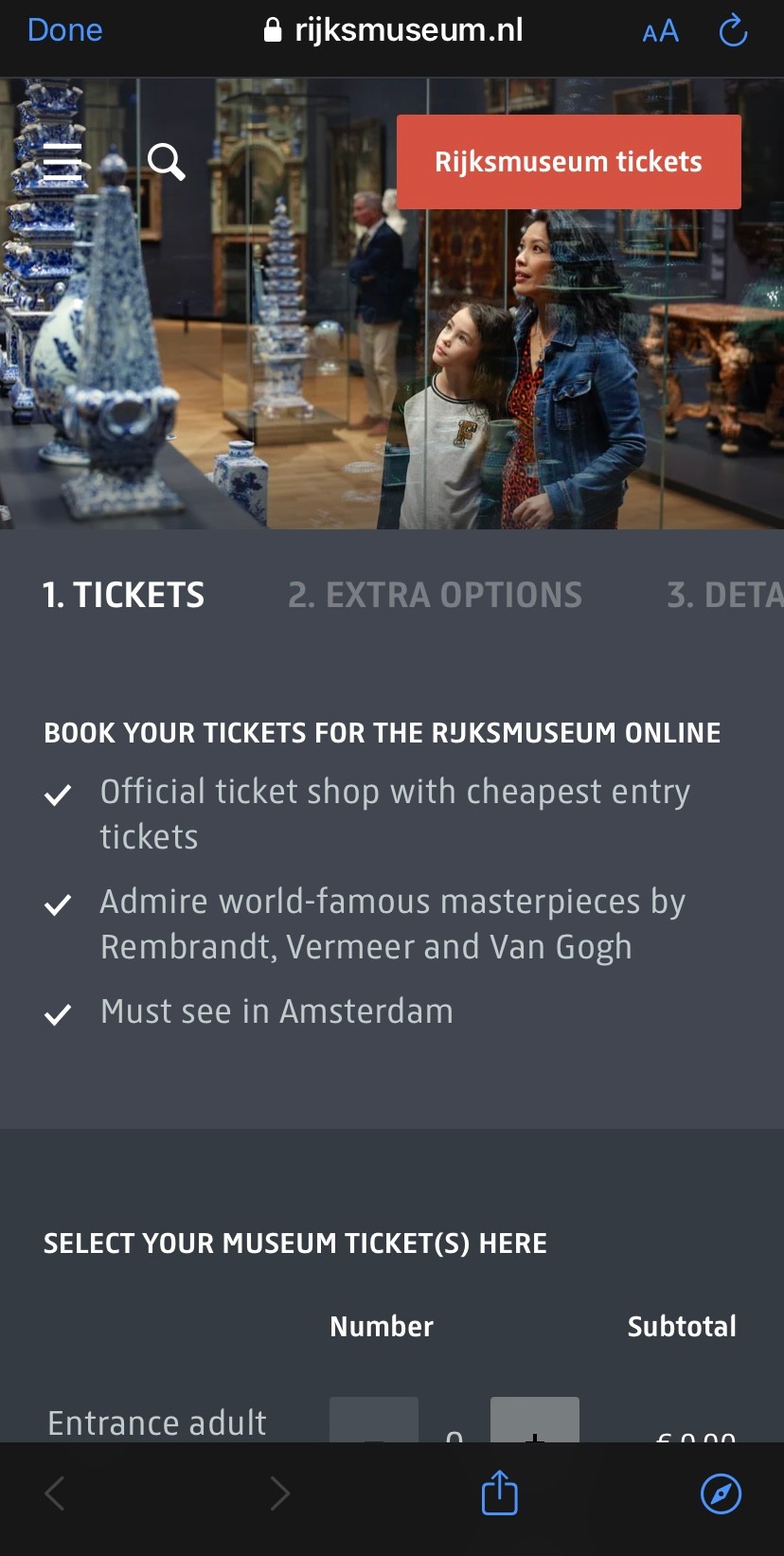
Although visually refined, the Rijksmuseum app breaks the flow by redirecting users to an external website for ticket booking. This shift disrupts the experience, forcing users out of the app and creating friction in what should be a seamless, mobile-first journey.
So, what features get us there?
Exploring
Opens the app
Explore
Sees all options
Books tickets
In app tickets
Organisation
Desirable future
User need
Features
Quick acces
Clear homepage
Filters by interest
Saved visitor info
In-app ticket
Saved visits
“My Tickets” section
Detailed event pages
Clarity
Transparency
Ease
Organisation
Discovery
Overview
Simplicity
Convenience
Control
Planning
Scenario & Results
Resulting Revisions
To simulate a realistic use case, I asked participants to navigate and book an exhibition through the Rijksmuseum screen, which contained the only fully functional booking flow in the prototype. This helped assess the full experience from discovery to confirmation.
04 Testing
Key Takeaways
Improved page hierarchy with clearer headers and navigation cues
Introduced filter functionality for category, location, and accessibility
Simplified CTA button to "Book Tickets" for clarity and scannability
Measure how intuitively users navigate exhibition listings
completed the booking without help
5/5
participants found it difficult to distinguish the homepage from the exhibitions page, describing the content as too visually similar
5/5
said they wished there were filters or categories to help them narrow down the exhibition options
4/5
found it unclear whether they were browsing all content or a curated list
3/5
said the booking button label felt too long and complex
4/5
had trouble distinguishing between homepage and exhibition pages
3/5
3/5
Said the booking button label felt too long and complex
users were able to navigate the platform with ease
4/5
5/5
Had trouble distinguishing between homepage and exhibition pages
4/5
Said they wished there were filters to narrow down exhibitions
Determine if users could successfully book tickets
Goal 1
Goal 2
Identify any confusing or unclear UI elements
Goal 4
Identify usability breakdowns within navigation flows
Goal 3
Before
Before
After
After

Desirable future
Opens the app
Explores all exhibitions in one place
Sees clear dates, times, and ticket options
Books tickets directly in-app
Stores and manages tickets within the app
Views and organises visit details easily
During this phase, I sketched out initial feature ideas and started defining the visual style and tone of the project.
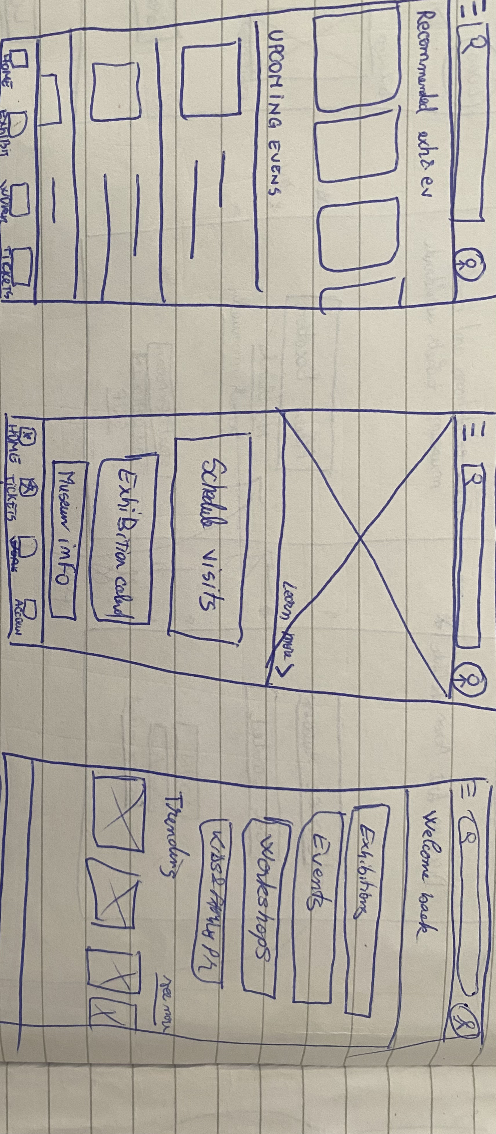
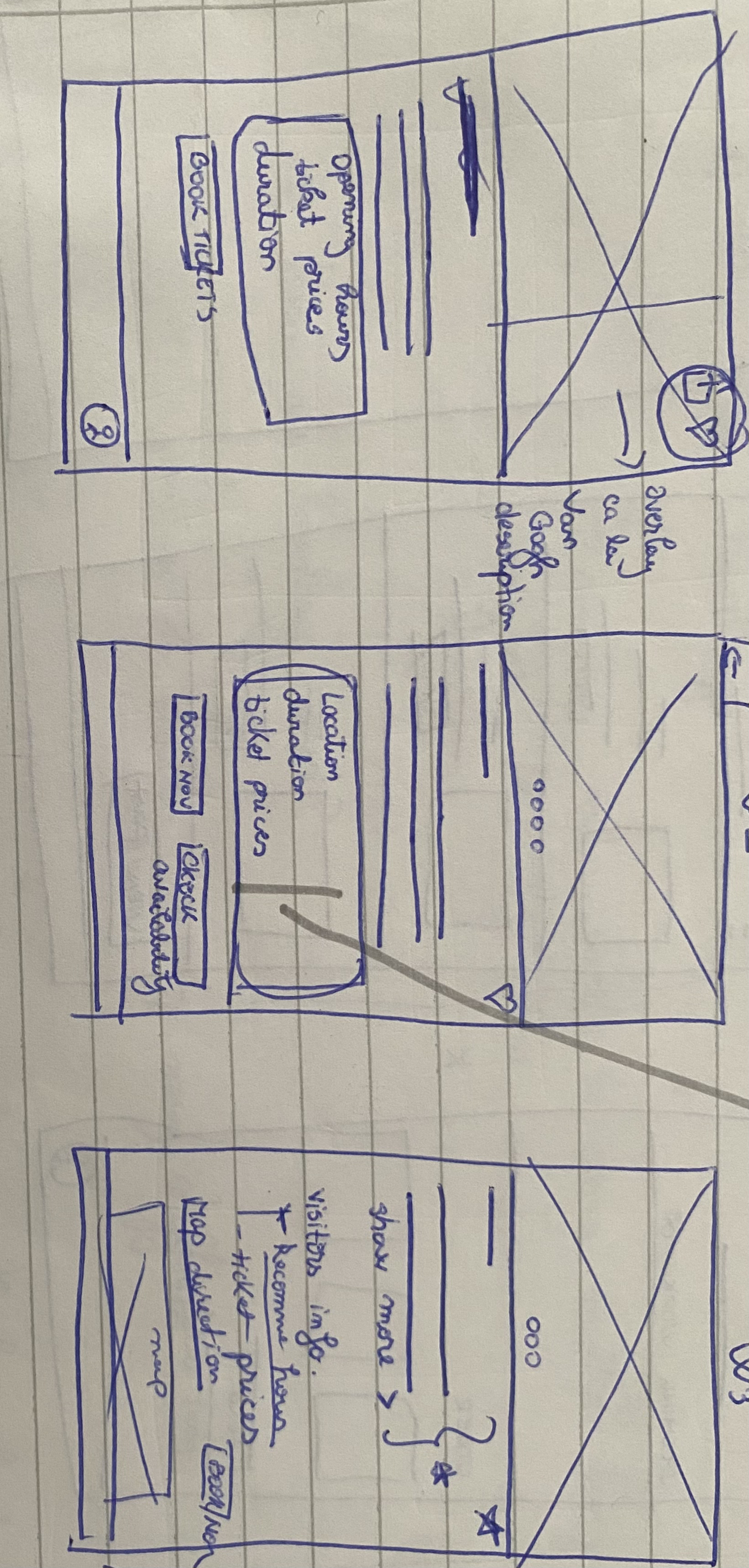
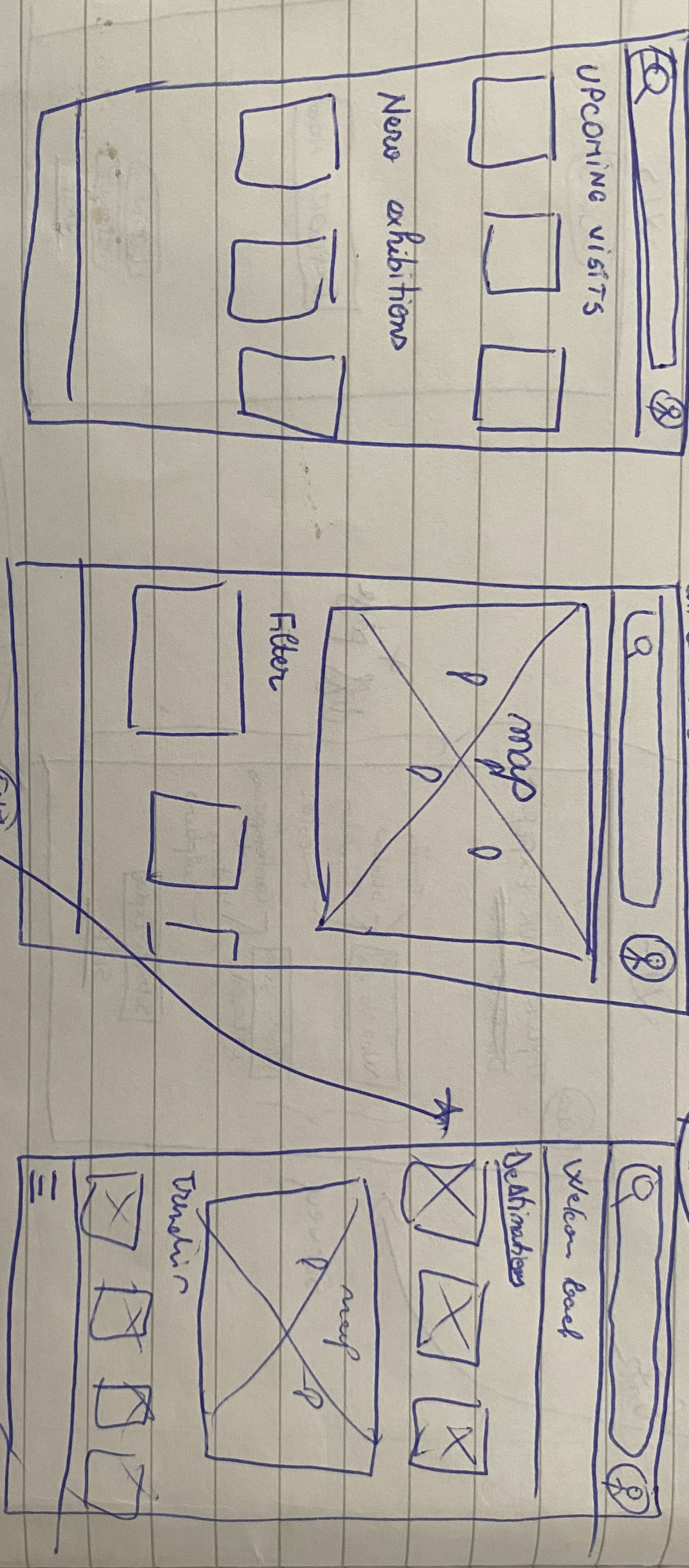
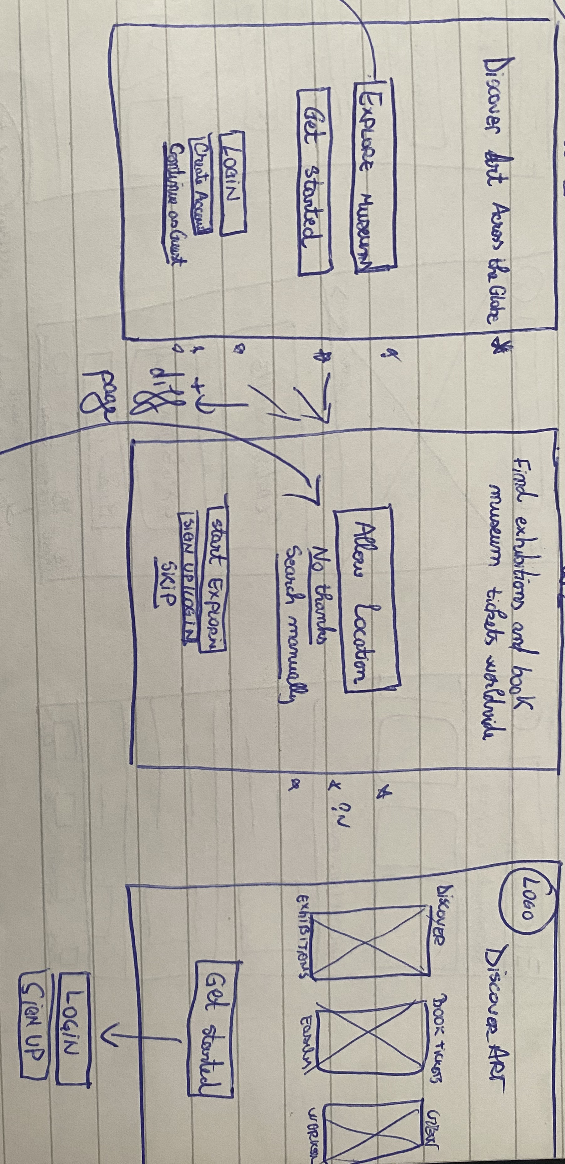
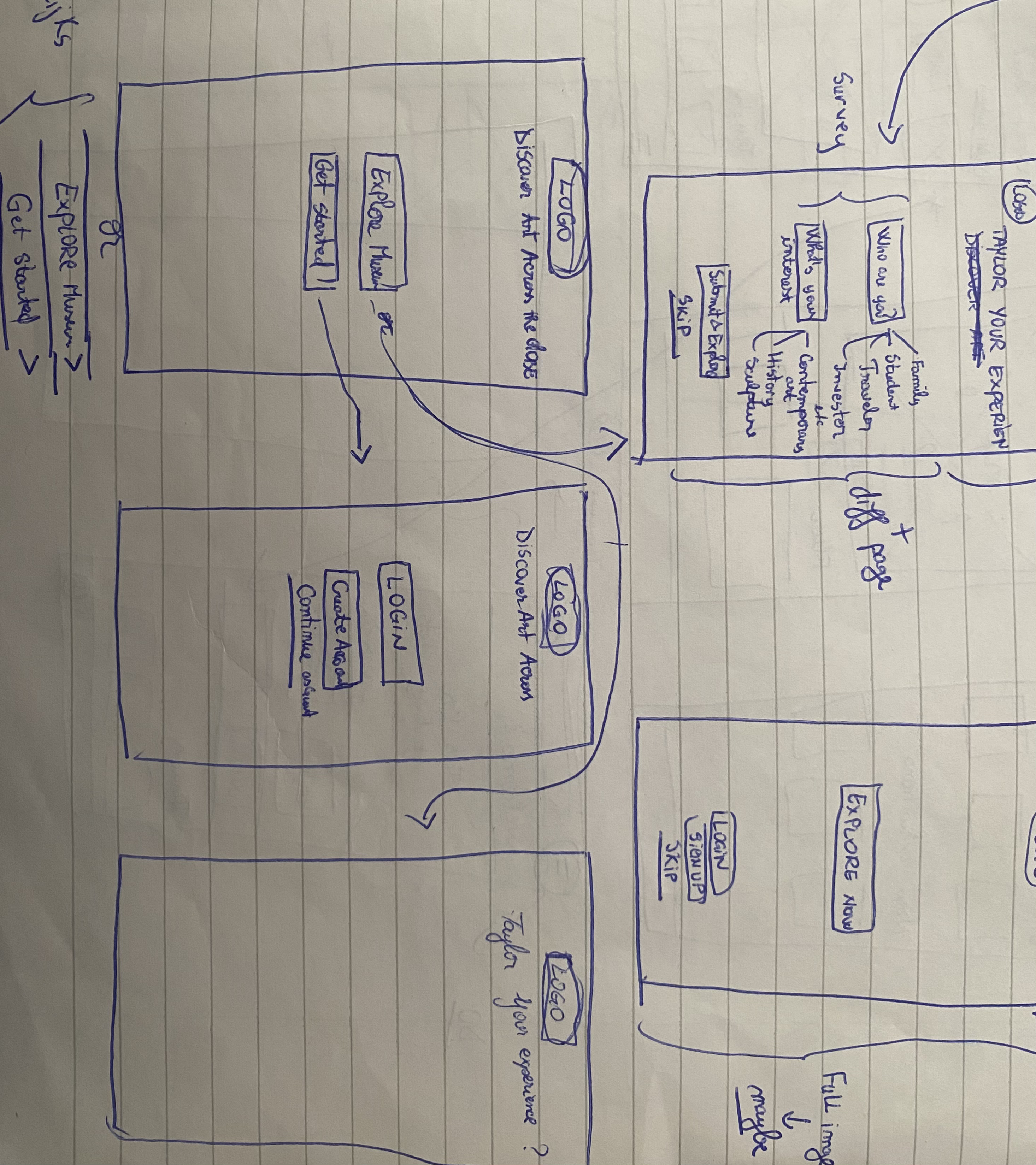
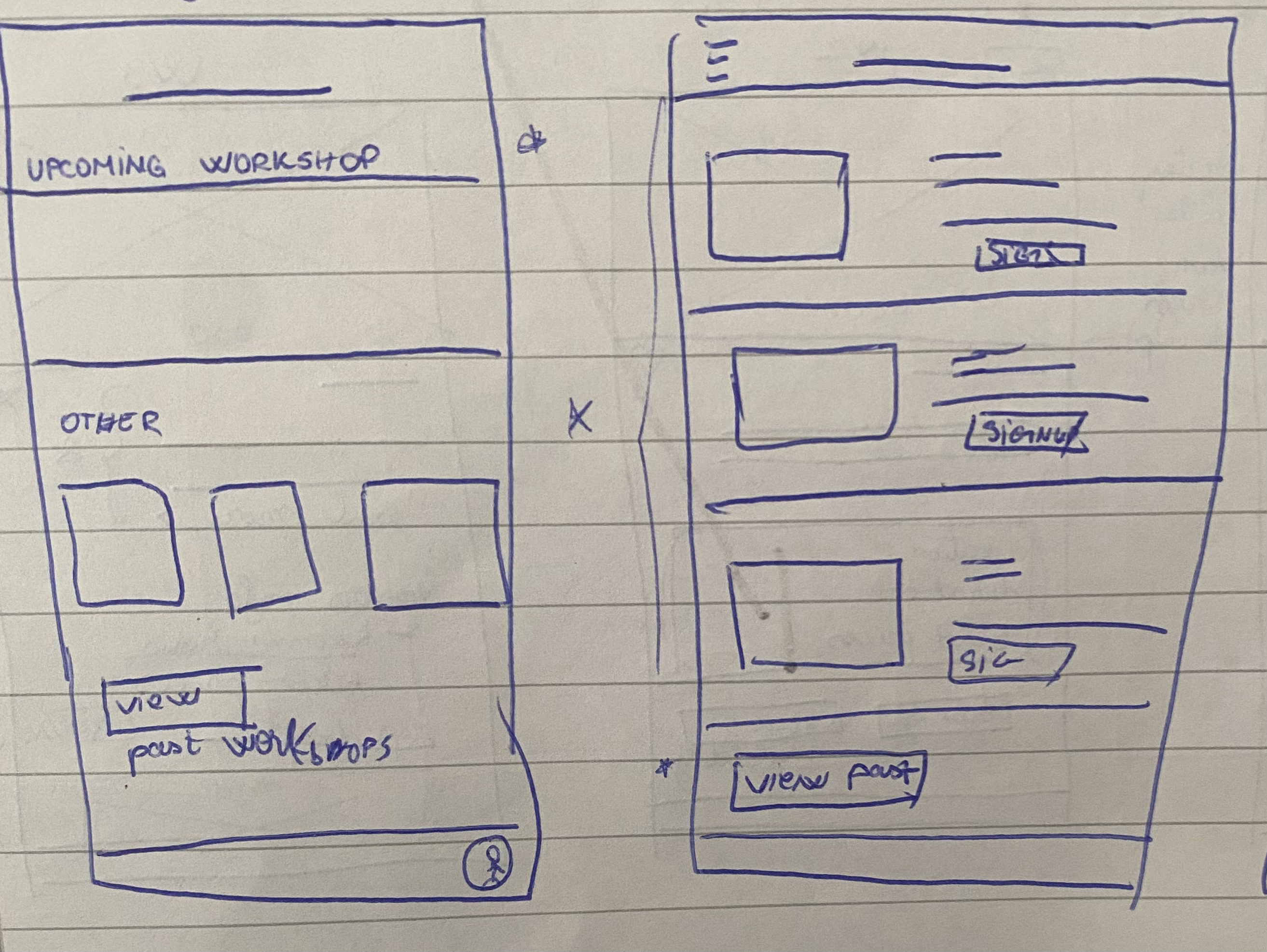
Wireframes allowed me to iterate on layouts early and ensure the structure was clear and user-friendly before moving into visual design.
Wireframes
LOGO
Discover Art Across the Globe
Get started
LOGO
Discover Art Across the Globe
Login
Continue as Guest
Create Account
Order tickets
Order tickets
Choose a date
At what time do you want to visit the museum?
Available
Selected
Almost full
11:30
14:00
12:00
14:15
12:30
14:30
13:30
15:30
Next step
Tips for booking tickets
Exhibitions & Events
Workshops
Destinations
Trending
Search destinations & experiences
Workshops
Painting Workshops
Children’s Workshops
Learn more
Learn more
View past workshops
Learn more
Learn more
Show more
Learn more
Learn more
Learn more
Learn more
Show more
Learn more
Learn more
Learn more
Learn more
Show more
Other workshops and activities
Plan to spend: 4- 5 hours
Best time to visit: Early morning/ evening
Opening hours: 9 AM - 6PM
Best time to book: 2 weeks in advance
Check availability & Book now
Share your experience
Learn more
Order tickets
Select your ticket type below
Select your tickets
Number
Adults
€22.00
€22.00
€11.00
€0.00
Young people up to 18 years old
Student
Total price:
Show more tickets
Book a group visit
1
+
-
+
-
0
+
-
0
Previous step
Next step
Order tickets
How would you like to receive the e-tickets?
First name*
Last name*
Place of residence
Email address *
* Mandatory fields
Confirm email address *
Country
Previous step
Next step
Order tickets
Check your order
Personal data
Date of visit
Tickets
Adults
€22.00
1
€22.00
Total price:
Previous step
Next step
Order tickets
Payment options
Show more options
Complete
Your tickets
Congratulations!
Enjoy your visit to .........
My Tickets
All tickets
Upcoming
Past
Building on the low-fidelity wireframes, I created the first set of high-fidelity key screens, focusing on visual design and testing the overall look and feel as a foundation for future refinements.
High-fidelity key-screens (first version)
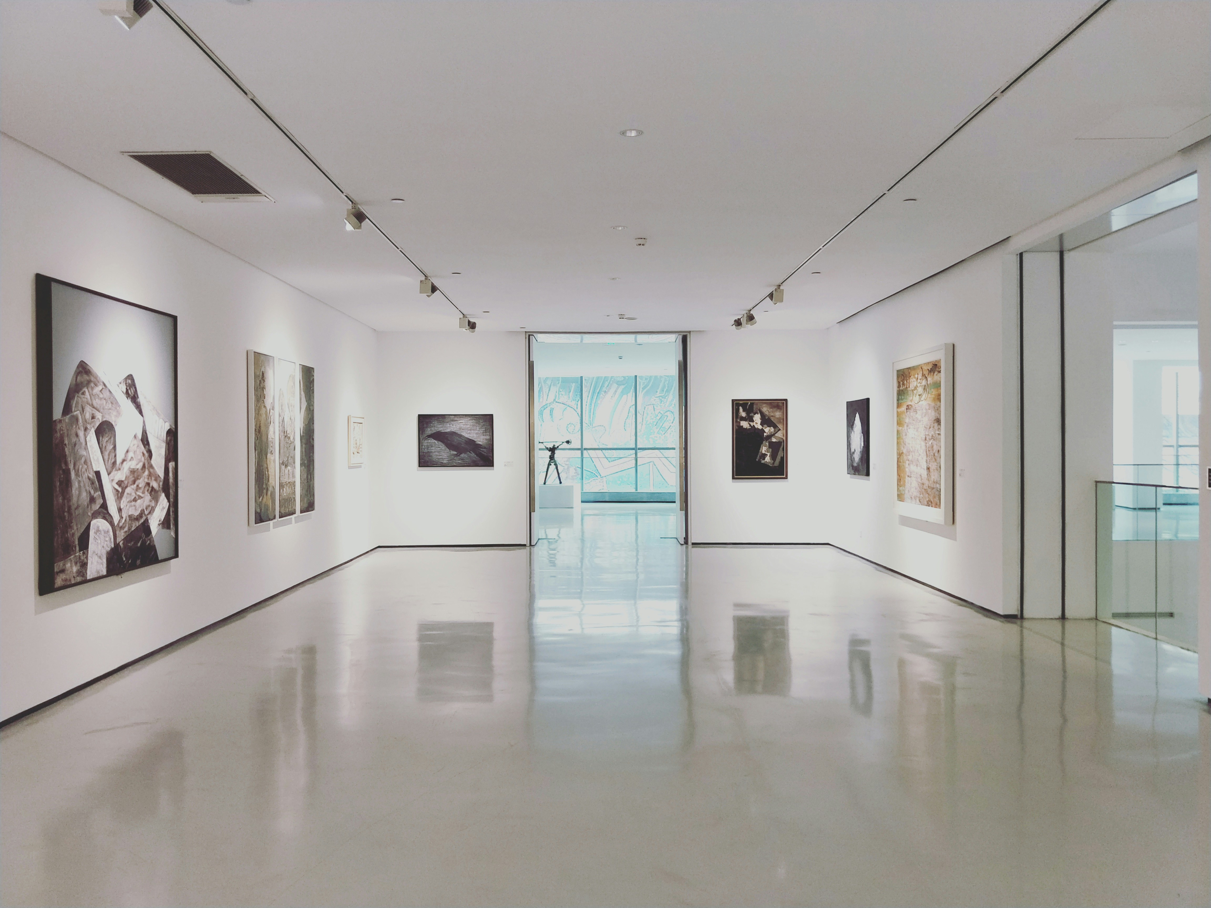
The Rijksmuseum
4,7
Groninger Museum
GRONINGEN
Van Gogh Museum
AMSTERDAM
AMSTERDAM
Workshops
Exhibitions
Destinations
Trending
Search destinations & experiences
Amsterdam
Groningen
Paris
Prague




Moco Museum
AMSTERDAM
Anne Frank House
AMSTERDAM
4,7
€22.50
from
€22.50
from
4,7
€22.50
from
4,7
€22.50
from
4,7
€22.50
from
Welcome!
Become a patron
Notifications
Settings
Help & Support
About
Log out
Families and children
Profile
Order tickets
Home
My Tickets
Favourites

Choose a date
When would you like to visit the museum?
Available
Selected
Almost full
11:30
14:00
12:00
14:15
12:30
14:30
13:30
15:30
Next step
3
2
1
31
30
29
28
27
26
25
24
23
22
21
20
19
18
17
16
15
14
13
12
11
10
9
8
7
6
5
4
3
2
1
31
Su
Sa
Fr
Th
We
Tu
Mo
November 2024
3
2
Order tickets
Select your ticket type below
Select your tickets
Number
Adults
€22.00
€22.00
€11.00
€0.00
Young people up to 18 years old
Student
Total price:
Show more tickets
Book a group visit
Home
My Tickets
Favourites

1
+
-
+
-
0
+
-
0
Previous step
Next step
Order tickets
How would you like to receive the e-tickets?
First name*
Last name*
Place of residence
Email address *
* Mandatory fields
Confirm email address *
Country
Previous step
Next step
Home
My Tickets
Favourites

Order tickets
Check your order
Personal data
Date of visit
Tickets
Adults
€22.00
1
€22.00
Total price:
Previous step
Next step
Home
My Tickets
Favourites

Order tickets
Payment options
Show more options
Complete
Home
My Tickets
Favourites

Your tickets
Congratulations!
Enjoy your visit to Rijksmuseum!
Home
My Tickets
Favourites

Workshops
Painting Workshops
Children’s Workshops
Learn more
Learn more
Learn more
Learn more
Learn more
Learn more
View past workshops
Show more
Show more
Show more
Other workshops and activities
Type city...
Select city:
Expressive Still Lifes
Nature in Detail
Constructing in color and shape
Children’s Biennale
Walk-in studio
You'll discover how to use expressive colours and dynamic brushstrokes to put a still life on canvas.
If you could step into the painting, where would you stand and which details would you paint?
During this workshop you follow the development towards abstraction: depicting it in colors and non-existing forms.
Invites kids and adults to get hands-on with art. Expect room-filling installations you can react to or help to build.
Are you creative and inquisitive? Our studio is right up your street!
Get creative with paint and brush! A Dutch-speaking workshop instructor will start by showing the children around the museum. They then get to work as artists themselves in a real studio.
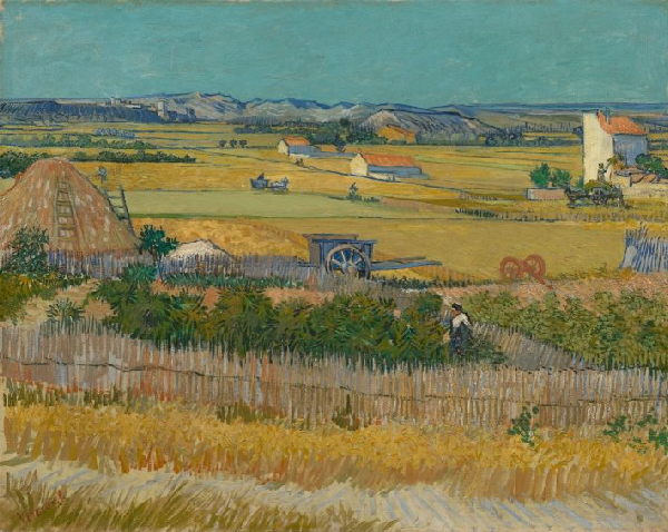
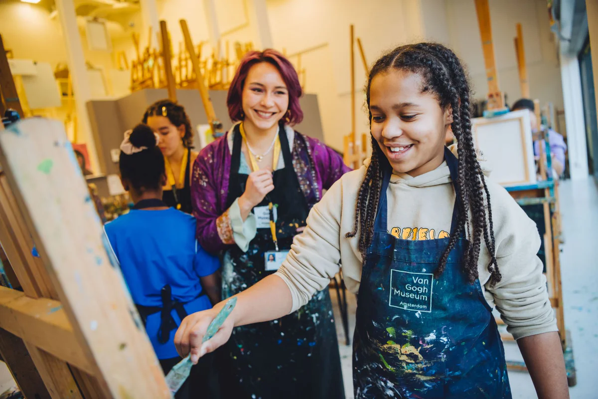
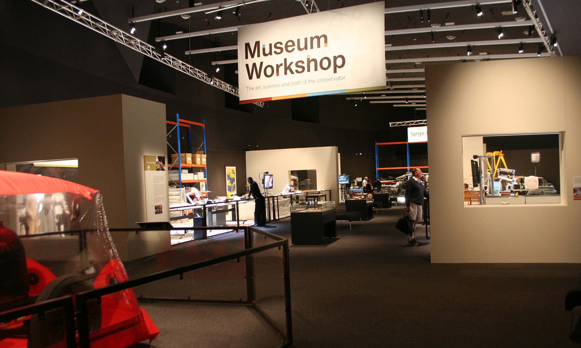
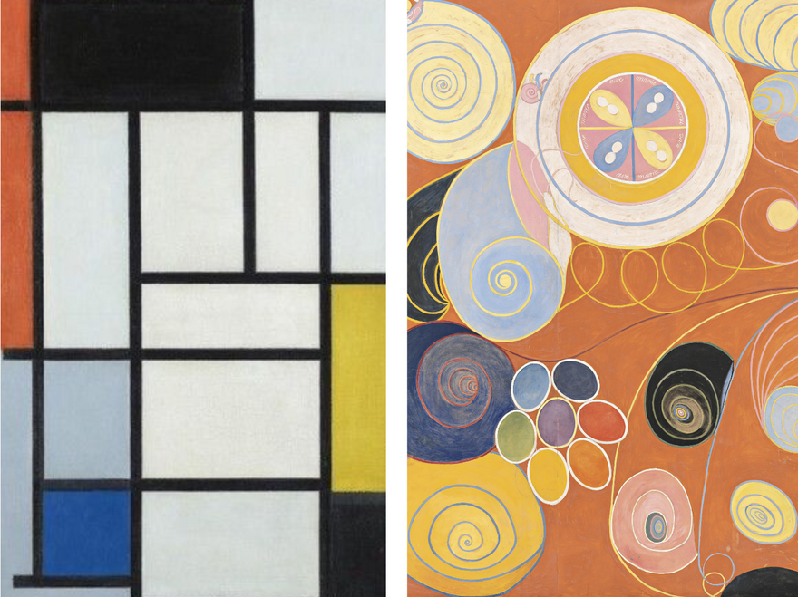
Home
My Tickets
Favourites

Workshops
Exhibitions

Plan to spend: 4 - 5 hours
Best time to visit: Early morning/ evening
Best time to book: 2 weeks in advance
Wheelchair accessible
Check availability & Book now
Share your experience
What’s on
Rijksmuseum
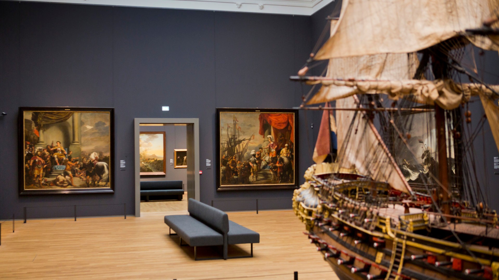
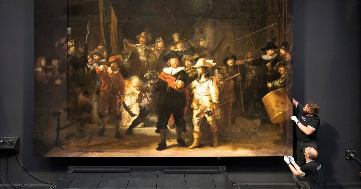
Spanning 800 years of Dutch history from 1200 to today, it features over 8,000 objects and rotating exhibitions, such as the popular Vermeer exhibition. Is a world-renowned museum in Amsterdam showcasing Dutch masterpieces like The Milkmaid by Vermeer, Self-portrait by Van Gogh, The Merry Family by Jan Steen, and Rembrandt’s Night Watch.
The Rijksmuseum

ASIAN BRONZE
FESTIVAL FRENZY
4000 Years of Beauty
The Best of the Rijksmuseum
Guided Tour | Daily
Photo Exhibition
OPERATION NIGHT WATCH
Home
My Tickets
Favourites

Opening hours
Address
Open today until 17:00
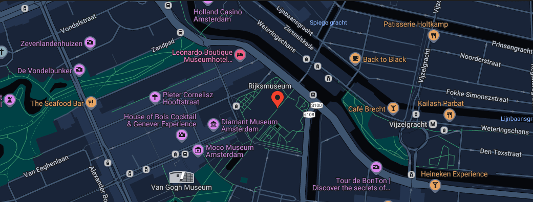
Museumstraat 1, 1071 XX, Amsterdam
Expressive Still Lifes
Workshops

Vincent van Gogh, 1889
Sunflowers
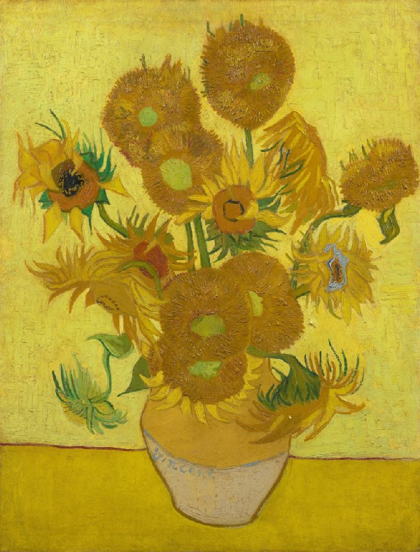
Sunflowers is probably one of the best-known still lifes ever painted. It is unmistakably by Vincent van Gogh. But what exactly is Van Gogh’s characteristic style? And how is this expressed in his other still lifes?
In the Expressive Still Lifes workshop you'll discover how to use expressive colours and dynamic brushstrokes to put a still life on canvas. After a short tour in the museum where you will look at Van Gogh’s still lifes, you will choose what you will work on. Will you paint your version of the Sunflowers, a fruit still life, or a pair of worn-out shoes, just like Vincent did?
Workshops dates
In English:
In Dutch:
Book a workshop
Home
My Tickets
Favourites

Van Gogh Museums Amsterdam
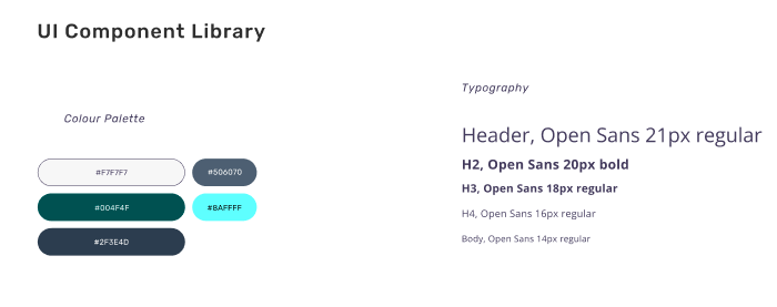
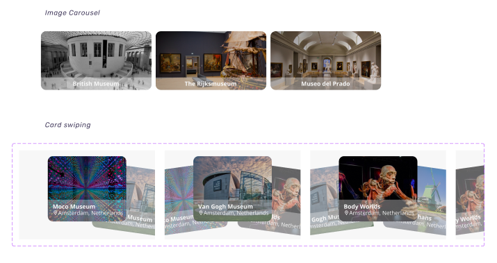
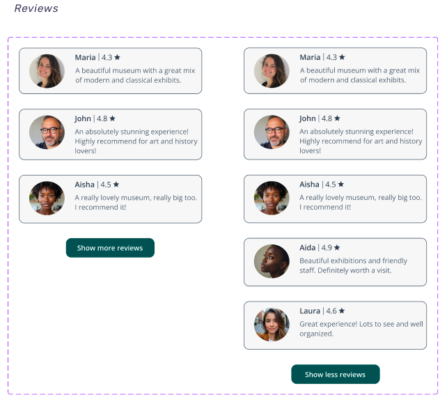
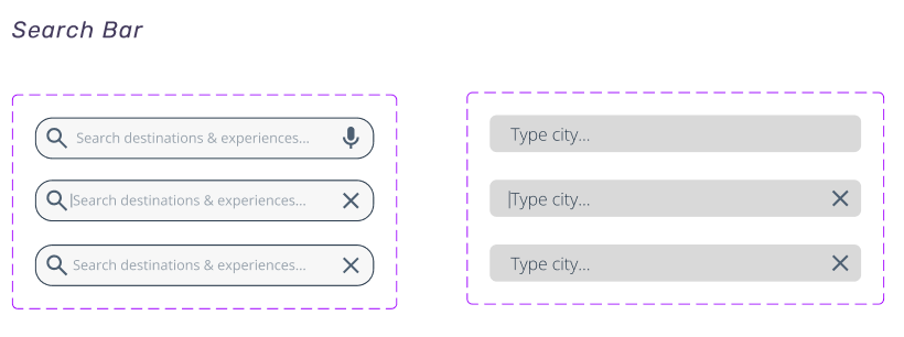
With the key screens in place, I focused on building a solid UI foundation. I selected accessible typography and a colour palette that reflected the cultural tone, then designed core interface components like buttons, flipping cards, carousel cards, a search bar, and a consistent bottom navigation bar.
UI Library Components
View Full UI Library
Determine if users could successfully book tickets
Measure how intuitively users navigate exhibition listings
Identify usability breakdowns within navigation flows
Identify any confusing or unclear UI elements
Goal 1
Goal 2
Goal 3
Goal 4
all participants described the booking flow as smooth and intuitive
5/5

Most museum visits start before you walk through the door. People look up exhibits, check opening hours, try to book tickets, but the process is often clunky and frustrating. Many museums still rely on outdated tools that are hard to navigate and spread across different platforms.
For most visitors, planning a museum trip isn’t as simple as it should be. Visitors juggle multiple sites, inconsistent booking systems, and hidden details like hours or workshops. Many lack mobile options. The challenge was clear: create a single, reliable platform where users can explore exhibitions, book visits, and access everything easily, turning confusion into inspiration.
Limitations
Key Takeaways
Users
Goals
Are frustrated by scattered museum websites and inconsistent mobile experiences
Are frustrated by scattered museum websites and inconsistent mobile experiences
Clear
Connected
Learnable
Accessible
Effortless
Due to time and resource constraints, most user feedback was gathered from peers and personal networks rather than a broad, diverse group of actual museum visitors.
While this input was helpful, it may not reflect the full spectrum of user needs, particularly those of tourists, families, or visitors with accessibility needs.
The research focused primarily on heuristic evaluations, mobile UX reviews, and competitor analysis, but on-site observational research with museum-goers was not conducted.
A more comprehensive usability study involving participants from different demographics interacting with the app in both planning and in-museum scenarios would help validate assumptions and refine key features.
Okay, what are the goals?
Goal 01
Enable users to book tickets and workshops through a quick, mobile-optimized flow
Goal 02
Design an intuitive mobile app with clear navigation and familiar patterns
Goal 03
Deliver a visually engaging and responsive interface designed for mobile use
Goal 04
Centralize access to exhibits, workshops, and ticketing in one experience
My first step was to assess how museum-goers were interacting with digital tools and what gaps existed. After reviewing websites, booking systems, and mobile accessibility, the fragmentation was obvious. Information was spread across platforms, and mobile usability was often poor or non-existent. The lack of dedicated museum apps wasn’t just a gap, it was a clear opportunity to improve the experience through a thoughtfully designed, all-in-one mobile solution.
The starting point
User pain points
01 Research
“The site wasn’t working well on my phone, I had to switch to my laptop."
"I lost my e-ticket because it was just an email attachment, not stored anywhere useful."
"Every time I visit a different museum, it’s like learning a new system from scratch."
"Nothing is linked, I had to open a separate site for each museum just to figure out what was on."
Type
UX/UI Design Project
Role
End-to-end UX/UI Designer
Timeline
2 months
Back to my notebook

06 Measuring Success
07 Next Steps
Since the app has not been released to the public, current success was measured by how effectively participants completed key tasks in testing. Every user was able to browse, filter, and book with ease, offering positive feedback about navigation and layout. However, this is only a starting point. Future iterations should include quantitative metrics, larger user pools, and real-world scenarios to get a more accurate picture of performance and impact.
The next phase involves releasing the platform to a broader audience and gathering real-world feedback. Post-launch, I plan to monitor usage data, identify usability issues, and enhance key features based on behavioural insights. Continuous design iteration will be at the core of this process, ensuring the platform remains useful, usable, and relevant over time.


05 Final UI
Rijksmuseum
Meet the Traveller
Improving Amelia’s user journey
Learning from competition
Before I got into wireframes and flows, I needed to figure out who I was really designing for. I built user personas based on research and user behaviours, fictional characters that made it easier to empathize with the end user. These helped bring clarity to the process and turned broad challenges into specific needs. One persona, in particular, stood out and shaped many of the choices I made.
When researching mobile experiences in the museum space, I quickly realised how few institutions offer a dedicated app. While some museums provide web-based tools or audio guides, there’s no consistent mobile solution for planning visits, booking tickets, and accessing exhibits. This absence revealed a clear opportunity: to create a centralised, mobile-first app that serves as a reliable companion for museum-goers.
With a clearer understanding of the issues travellers face, I was able to define how the visitor journey could be improved. I laid out the existing process, where visitors often jump between fragmented websites and booking systems, and envisioned a more seamless, mobile-first future state that could solve these key pain points.
To see how real users interacted with my first design iteration, I set up usability testing using a Figma prototype. Participants were primarily from my personal network due to time and resource constraints, yet their input helped highlight what was working and what needed improvement. My main testing goals were:
The test results confirmed that the app’s navigation and booking process had improved notably, but a few pain points remained. The original booking button was flagged as too wordy, and users found it difficult to distinguish between core pages. While adding filters was already part of the broader product vision, testing validated that this feature was more critical than anticipated. As a result, filters were added and structural tweaks were made to better communicate which part of the app users were in.
Users consistently pointed out that the original “Check availability & Book now” button felt too wordy and cluttered the screen. A major focus of this redesign was reducing cognitive load and making core actions feel more approachable. Streamlining it to “Book Tickets” helped improve scannability and reduced hesitation. This small change aligned with a larger objective of making the booking journey smoother and more focused on action. The new “Book Tickets” button not only offers a clearer call to action but also features improved contrast for better legibility, meeting WCAG accessibility standards. Alongside shortening the button label, spacing was refined and icons were added to improve scannability and support a more visually accessible experience.
Many users expressed that the homepage and exhibition views felt too similar, making navigation unintuitive. By redesigning the layout with more distinct tab styling and applying clear filters just below the navigation bar, users gained better context and control when browsing. These enhancements were a direct response to both user confusion and visual hierarchy gaps.
Existing
Searches online for museum options
Switches between multiple websites
Looks up dates and times separately
Faces different booking flows per museum
Receives tickets via email or screenshots
Struggles to keep track of bookings
Desirable future
Opens the app
Explores all exhibitions in one place
Sees clear dates, times, and ticket options
Books tickets directly in-app
Stores and manages tickets within the app
Views and organises visit details easily
02 Define
03 Design
Fragmented experience, inconsistent processes, extra effort required
One platform, clear flow, minimal cognitive load
Flow & Continuity
Although visually refined, the Rijksmuseum app breaks the flow by redirecting users to an external website for ticket booking. This shift disrupts the experience, forcing users out of the app and creating friction in what should be a seamless, mobile-first journey.
So, what features get us there?
Exploring
Opens the app
Explore
Sees all options
Books tickets
In app tickets
Organisation
Desirable future
User need
Features
Quick acces
Clear homepage
Filters by interest
Saved visitor info
In-app ticket
Saved visits
“My Tickets” section
Detailed event pages
Clarity
Transparency
Ease
Organisation
Discovery
Overview
Simplicity
Convenience
Control
Planning
Scenario & Results
Resulting Revisions
To simulate a realistic use case, I asked participants to navigate and book an exhibition through the Rijksmuseum screen, which contained the only fully functional booking flow in the prototype. This helped assess the full experience from discovery to confirmation.
04 Testing
Key Takeaways
Improved page hierarchy with clearer headers and navigation cues
Introduced filter functionality for category, location, and accessibility
Simplified CTA button to "Book Tickets" for clarity and scannability
Measure how intuitively users navigate exhibition listings
completed the booking without help
5/5
participants found it difficult to distinguish the homepage from the exhibitions page, describing the content as too visually similar
5/5
said they wished there were filters or categories to help them narrow down the exhibition options
4/5
found it unclear whether they were browsing all content or a curated list
3/5
said the booking button label felt too long and complex
4/5
had trouble distinguishing between homepage and exhibition pages
3/5
3/5
Said the booking button label felt too long and complex
users were able to navigate the platform with ease
4/5
5/5
Had trouble distinguishing between homepage and exhibition pages
4/5
Said they wished there were filters to narrow down exhibitions
Determine if users could successfully book tickets
Goal 1
Goal 2
Identify any confusing or unclear UI elements
Goal 4
Identify usability breakdowns within navigation flows
Goal 3
Before
Before
After
After


Desirable future
Opens the app
Explores all exhibitions in one place
Sees clear dates, times, and ticket options
Books tickets directly in-app
Stores and manages tickets within the app
Views and organises visit details easily
During this phase, I sketched out initial feature ideas and started defining the visual style and tone of the project.


Wireframes allowed me to iterate on layouts early and ensure the structure was clear and user-friendly before moving into visual design.
Wireframes
LOGO
Discover Art Across the Globe
Get started
LOGO
Discover Art Across the Globe
Login
Continue as Guest
Create Account
Order tickets
Order tickets
Choose a date
At what time do you want to visit the museum?
Available
Selected
Almost full
11:30
14:00
12:00
14:15
12:30
14:30
13:30
15:30
Next step
Tips for booking tickets
Exhibitions & Events
Workshops
Destinations
Trending
Search destinations & experiences
Workshops
Painting Workshops
Children’s Workshops
Learn more
Learn more
View past workshops
Learn more
Learn more
Show more
Learn more
Learn more
Learn more
Learn more
Show more
Learn more
Learn more
Learn more
Learn more
Show more
Other workshops and activities
Plan to spend: 4- 5 hours
Best time to visit: Early morning/ evening
Opening hours: 9 AM - 6PM
Best time to book: 2 weeks in advance
Check availability & Book now
Share your experience
Learn more
Order tickets
Select your ticket type below
Select your tickets
Number
Adults
€22.00
€22.00
€11.00
€0.00
Young people up to 18 years old
Student
Total price:
Show more tickets
Book a group visit
1
+
-
+
-
0
+
-
0
Previous step
Next step
Order tickets
How would you like to receive the e-tickets?
First name*
Last name*
Place of residence
Email address *
* Mandatory fields
Confirm email address *
Country
Previous step
Next step
Order tickets
Check your order
Personal data
Date of visit
Tickets
Adults
€22.00
1
€22.00
Total price:
Previous step
Next step
Order tickets
Payment options
Show more options
Complete
Your tickets
Congratulations!
Enjoy your visit to .........
My Tickets
All tickets
Upcoming
Past
Building on the low-fidelity wireframes, I created the first set of high-fidelity key screens, focusing on visual design and testing the overall look and feel as a foundation for future refinements.
High-fidelity key-screens (first version)
The Rijksmuseum
4,7
Groninger Museum
GRONINGEN
Van Gogh Museum
AMSTERDAM
AMSTERDAM

Workshops
Exhibitions
Destinations
Trending
Search destinations & experiences

Amsterdam
Groningen
Paris
Prague


Moco Museum
AMSTERDAM
Anne Frank House
AMSTERDAM
4,7
€22.50
from
€22.50
from
4,7
€22.50
from
4,7
€22.50
from
4,7
€22.50
from
Welcome!
Become a patron
Notifications
Settings
Help & Support
About
Log out
Families and children
Profile
Order tickets
Home
My Tickets
Favourites

Choose a date
When would you like to visit the museum?
Available
Selected
Almost full
11:30
14:00
12:00
14:15
12:30
14:30
13:30
15:30
Next step
3
2
1
31
30
29
28
27
26
25
24
23
22
21
20
19
18
17
16
15
14
13
12
11
10
9
8
7
6
5
4
3
2
1
31
Su
Sa
Fr
Th
We
Tu
Mo
November 2024
3
2
Order tickets
Select your ticket type below
Select your tickets
Number
Adults
€22.00
€22.00
€11.00
€0.00
Young people up to 18 years old
Student
Total price:
Show more tickets
Book a group visit
Home
My Tickets
Favourites

1
+
-
+
-
0
+
-
0
Previous step
Next step
Order tickets
How would you like to receive the e-tickets?
First name*
Last name*
Place of residence
Email address *
* Mandatory fields
Confirm email address *
Country
Previous step
Next step
Home
My Tickets
Favourites

Order tickets
Check your order
Personal data
Date of visit
Tickets
Adults
€22.00
1
€22.00
Total price:
Previous step
Next step
Home
My Tickets
Favourites

Order tickets
Payment options
Show more options
Complete
Home
My Tickets
Favourites

Your tickets
Congratulations!
Enjoy your visit to Rijksmuseum!
Home
My Tickets
Favourites

Workshops
Painting Workshops
Children’s Workshops
Learn more
Learn more
Learn more
Learn more
Learn more
Learn more
View past workshops
Show more
Show more
Show more
Other workshops and activities
Type city...
Select city:

Expressive Still Lifes
Nature in Detail
Constructing in color and shape
Children’s Biennale
Walk-in studio
You'll discover how to use expressive colours and dynamic brushstrokes to put a still life on canvas.
If you could step into the painting, where would you stand and which details would you paint?
During this workshop you follow the development towards abstraction: depicting it in colors and non-existing forms.
Invites kids and adults to get hands-on with art. Expect room-filling installations you can react to or help to build.
Are you creative and inquisitive? Our studio is right up your street!
Get creative with paint and brush! A Dutch-speaking workshop instructor will start by showing the children around the museum. They then get to work as artists themselves in a real studio.


Home
My Tickets
Favourites

Workshops
Exhibitions

Plan to spend: 4 - 5 hours
Best time to visit: Early morning/ evening
Best time to book: 2 weeks in advance
Wheelchair accessible
Check availability & Book now
Share your experience
What’s on


Rijksmuseum
Spanning 800 years of Dutch history from 1200 to today, it features over 8,000 objects and rotating exhibitions, such as the popular Vermeer exhibition. Is a world-renowned museum in Amsterdam showcasing Dutch masterpieces like The Milkmaid by Vermeer, Self-portrait by Van Gogh, The Merry Family by Jan Steen, and Rembrandt’s Night Watch.
The Rijksmuseum


ASIAN BRONZE
FESTIVAL FRENZY
4000 Years of Beauty
The Best of the Rijksmuseum
Guided Tour | Daily
Photo Exhibition

OPERATION NIGHT WATCH
Home
My Tickets
Favourites

Opening hours
Address
Open today until 17:00

Museumstraat 1, 1071 XX, Amsterdam
Expressive Still Lifes
Workshops

Vincent van Gogh, 1889
Sunflowers
Sunflowers is probably one of the best-known still lifes ever painted. It is unmistakably by Vincent van Gogh. But what exactly is Van Gogh’s characteristic style? And how is this expressed in his other still lifes?
In the Expressive Still Lifes workshop you'll discover how to use expressive colours and dynamic brushstrokes to put a still life on canvas. After a short tour in the museum where you will look at Van Gogh’s still lifes, you will choose what you will work on. Will you paint your version of the Sunflowers, a fruit still life, or a pair of worn-out shoes, just like Vincent did?
Workshops dates
In English:
In Dutch:
Book a workshop
Home
My Tickets
Favourites

Van Gogh Museums Amsterdam
With the key screens in place, I focused on building a solid UI foundation. I selected accessible typography and a colour palette that reflected the cultural tone, then designed core interface components like buttons, flipping cards, carousel cards, a search bar, and a consistent bottom navigation bar.
UI Library Components


View Full UI Library
Determine if users could successfully book tickets
Measure how intuitively users navigate exhibition listings
Identify usability breakdowns within navigation flows
Identify any confusing or unclear UI elements
Goal 1
Goal 2
Goal 3
Goal 4
all participants described the booking flow as smooth and intuitive
5/5


Most museum visits start before you walk through the door. People look up exhibits, check opening hours, try to book tickets, but the process is often clunky and frustrating. Many museums still rely on outdated tools that are hard to navigate and spread across different platforms.
03 Design
04 Testing
05 Final UI
06 Measuring success
07 Next steps
For most visitors, planning a museum trip isn’t as simple as it should be. Visitors juggle multiple sites, inconsistent booking systems, and hidden details like hours or workshops. Many lack mobile options. The challenge was clear: create a single, reliable platform where users can explore exhibitions, book visits, and access everything easily, turning confusion into inspiration.
Limitations
Key Takeaways
Users
Goals
Are frustrated by scattered museum websites and inconsistent mobile experiences
Are frustrated by scattered museum websites and inconsistent mobile experiences
Clear
Connected
Learnable
Accessible
Effortless
Due to time and resource constraints, most user feedback was gathered from peers and personal networks rather than a broad, diverse group of actual museum visitors.
While this input was helpful, it may not reflect the full spectrum of user needs, particularly those of tourists, families, or visitors with accessibility needs.
The research focused primarily on heuristic evaluations, mobile UX reviews, and competitor analysis, but on-site observational research with museum-goers was not conducted.
A more comprehensive usability study involving participants from different demographics interacting with the app in both planning and in-museum scenarios would help validate assumptions and refine key features.
Okay, what are the goals?
Goal 01
Enable users to book tickets and workshops through a quick, mobile-optimized flow
Goal 02
Design an intuitive mobile app with clear navigation and familiar patterns
Goal 03
Deliver a visually engaging and responsive interface designed for mobile use
Goal 04
Centralize access to exhibits, workshops, and ticketing in one experience
My first step was to assess how museum-goers were interacting with digital tools and what gaps existed. After reviewing websites, booking systems, and mobile accessibility, the fragmentation was obvious. Information was spread across platforms, and mobile usability was often poor or non-existent. The lack of dedicated museum apps wasn’t just a gap, it was a clear opportunity to improve the experience through a thoughtfully designed, all-in-one mobile solution.
The starting point
User pain points
01 Research
“The site wasn’t working well on my phone, I had to switch to my laptop."
"I lost my e-ticket because it was just an email attachment, not stored anywhere useful."
"Every time I visit a different museum, it’s like learning a new system from scratch."
"Nothing is linked, I had to open a separate site for each museum just to figure out what was on."
Type
UX/UI Design Project
Role
End-to-end UX/UI Designer
Timeline
2 months
Back to my notebook