
little

About the project
Context & problem
Visual Identity
UI overview
What changed


Disclaimer: This is a personal design exercise and is not affiliated with NSPCC. All trademarks and brand assets remain the property of their respective owners. Any figures shown in mockups are illustrative.
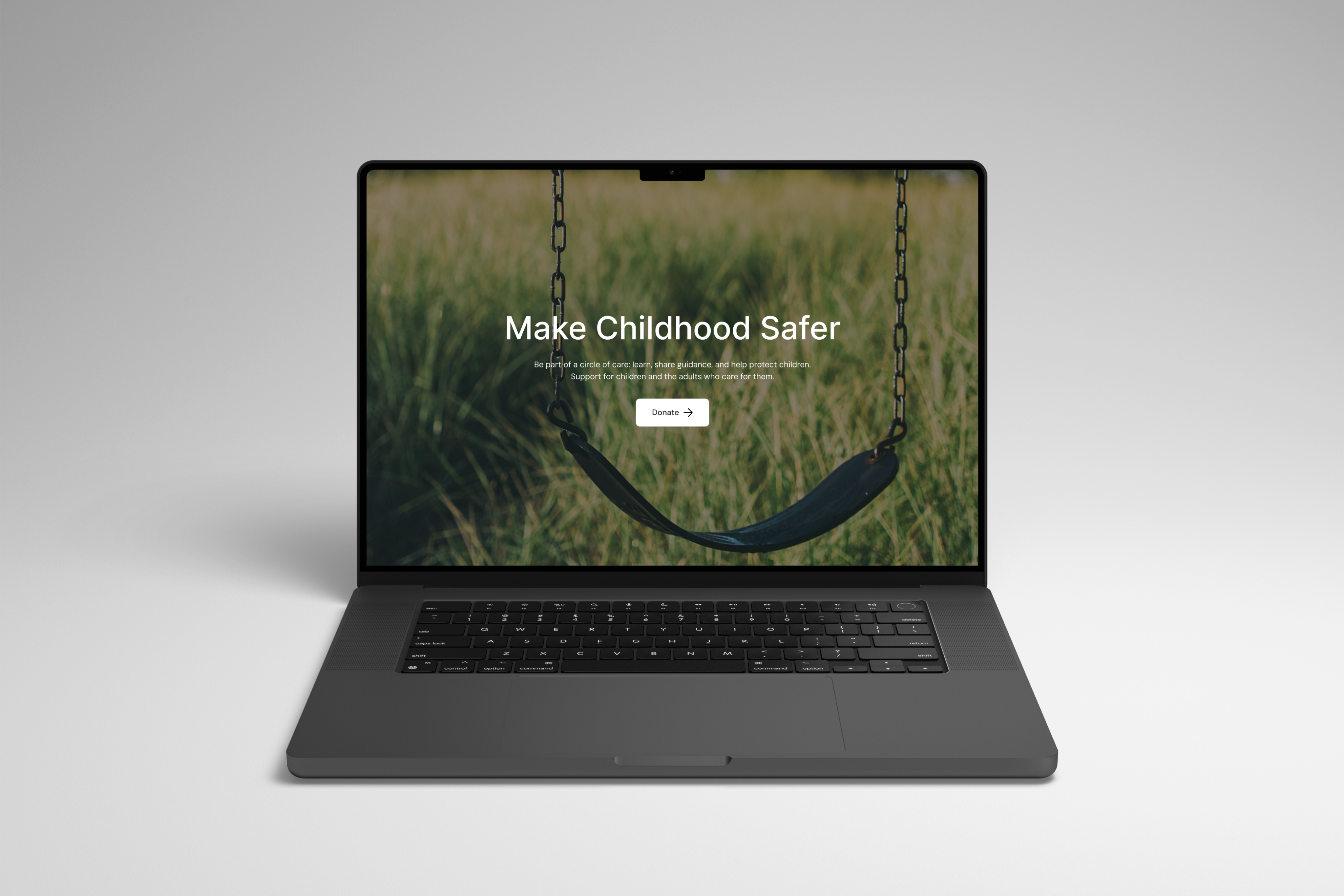
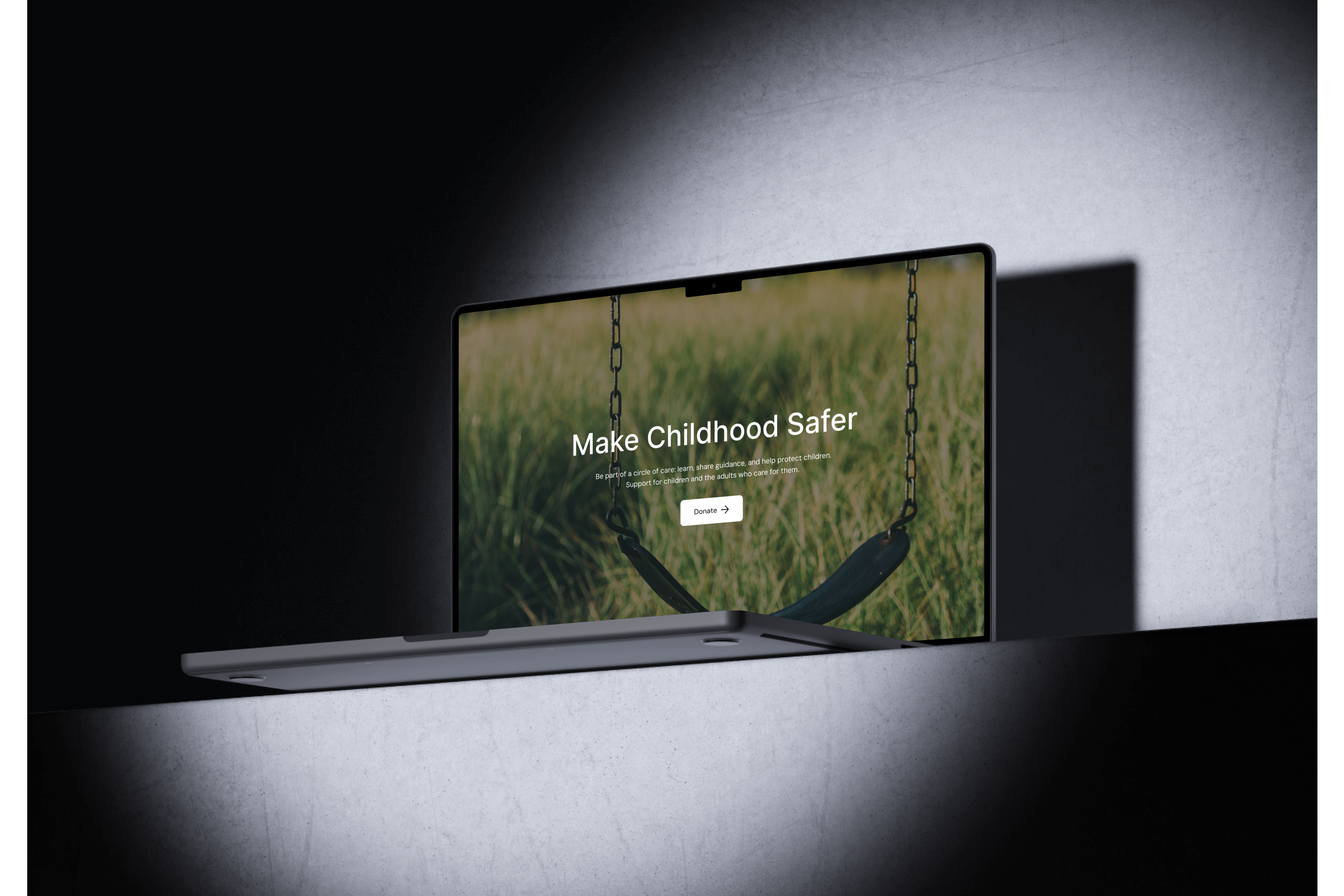
NSPCC serves multiple audiences: children in crisis, parents and carers seeking guidance, schools, and supporters. The original homepage has to speak to all of them at once, which can dilute focus. I redesigned the landing page to make urgent help and key actions easier to find while strengthening trust and readability.
Project
Web page
Category
Charity
Project year
2025
Who NSPCC serves


NSPCC speaks to four audiences at once:
- Children & young people who need immediate, safe guidance.
- Parents & carers looking for practical advice.
- Schools & professionals seeking training and safeguarding support.
- Donors & volunteers who fund the mission.
Problems found
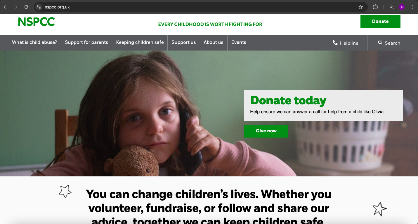
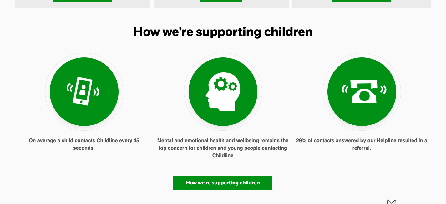
- Information-dense navigation made it hard to know where to start.
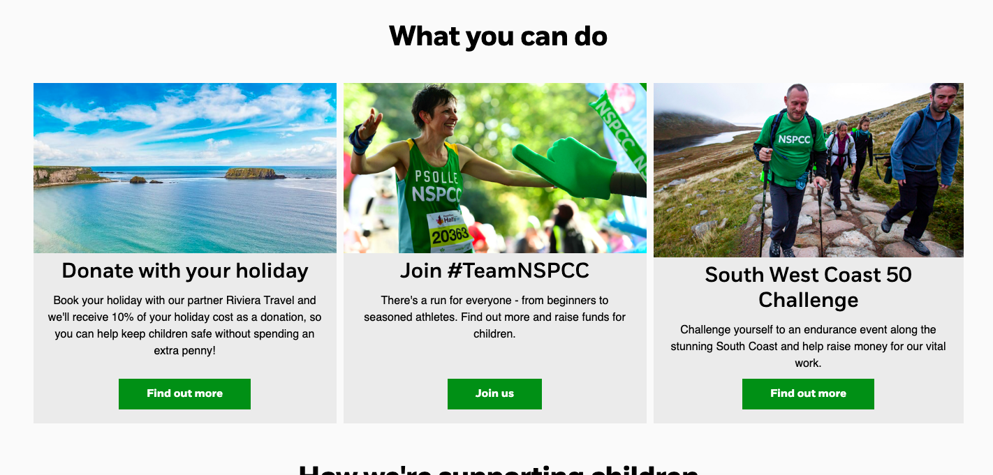
- Mixed page hierarchies (topics, audiences, and programs all at the same level) blurred decision paths.
- Donation vs. “Get help”: competing primary CTAs created cognitive friction at the very top of the page.
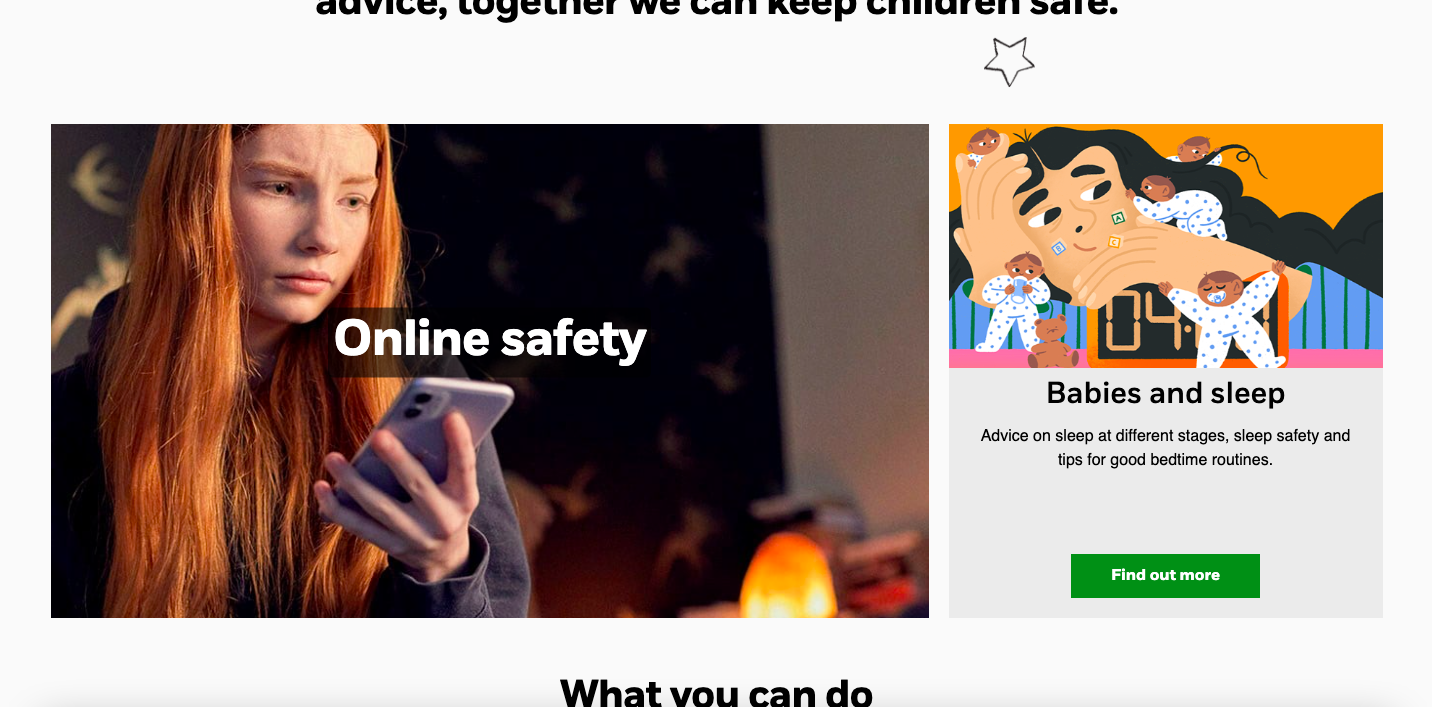
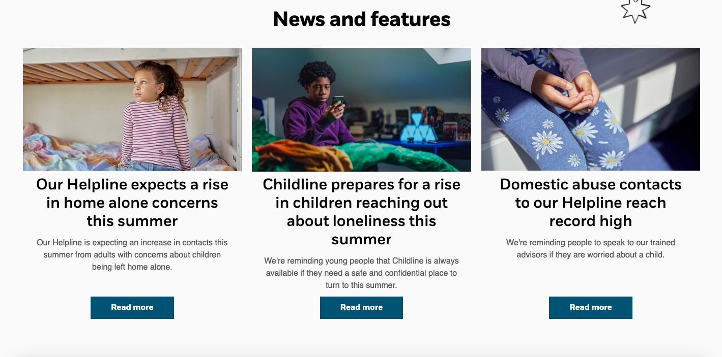
- Inconsistent card patterns (varying ratios, labels, and affordances) slowed scanning.
- Hero image readability/contrast was unreliable depending on photography.
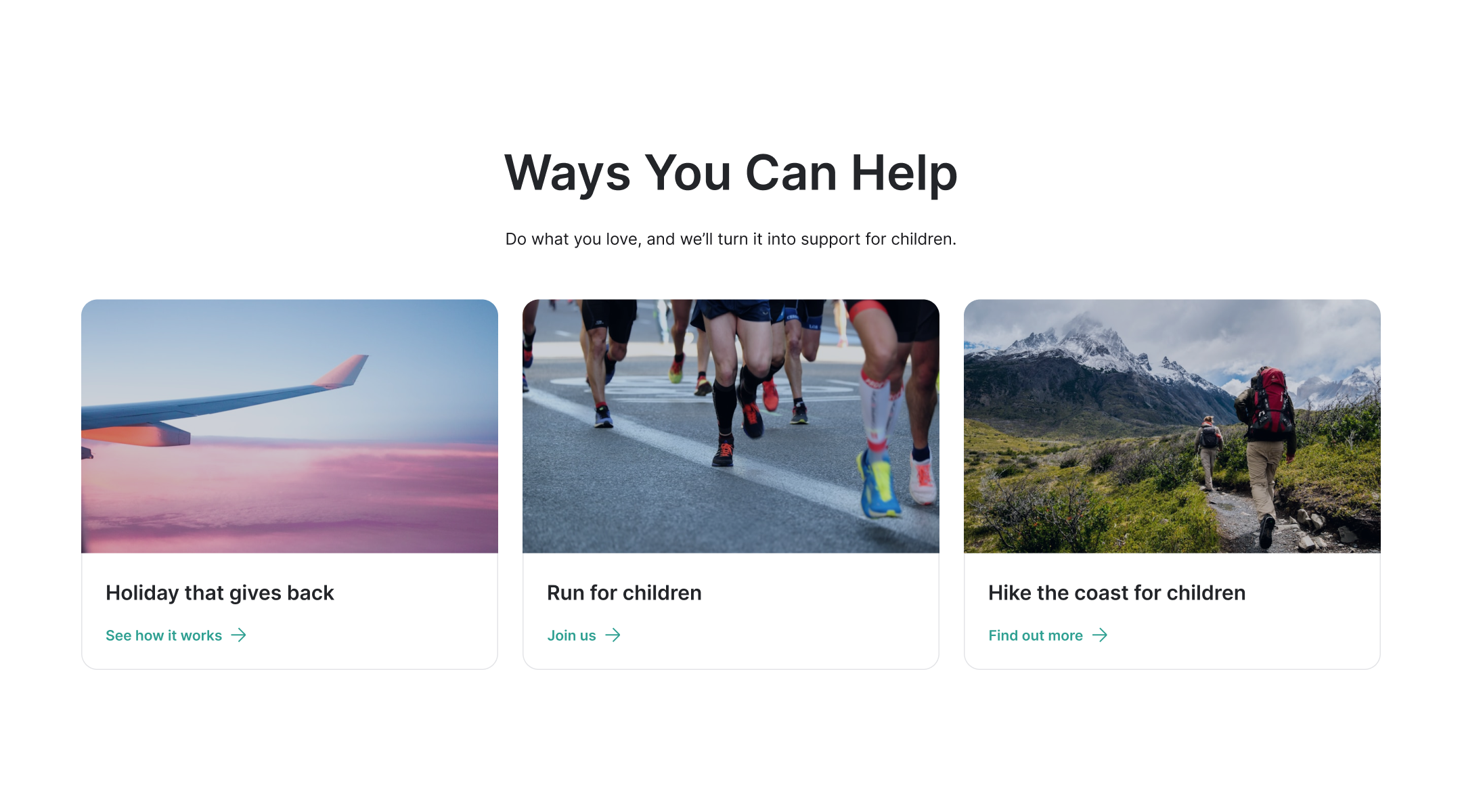
- “How to help” options were scattered across events, fundraising, and volunteering.
Design response
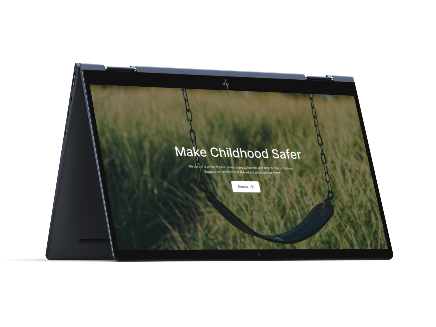
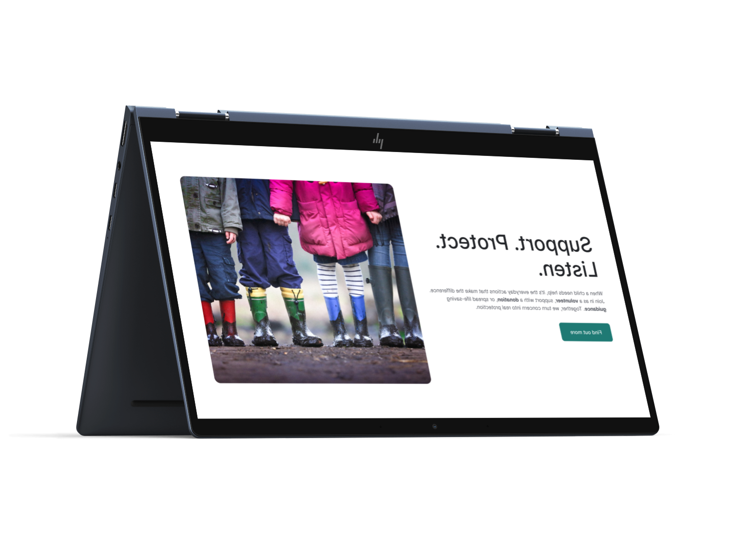
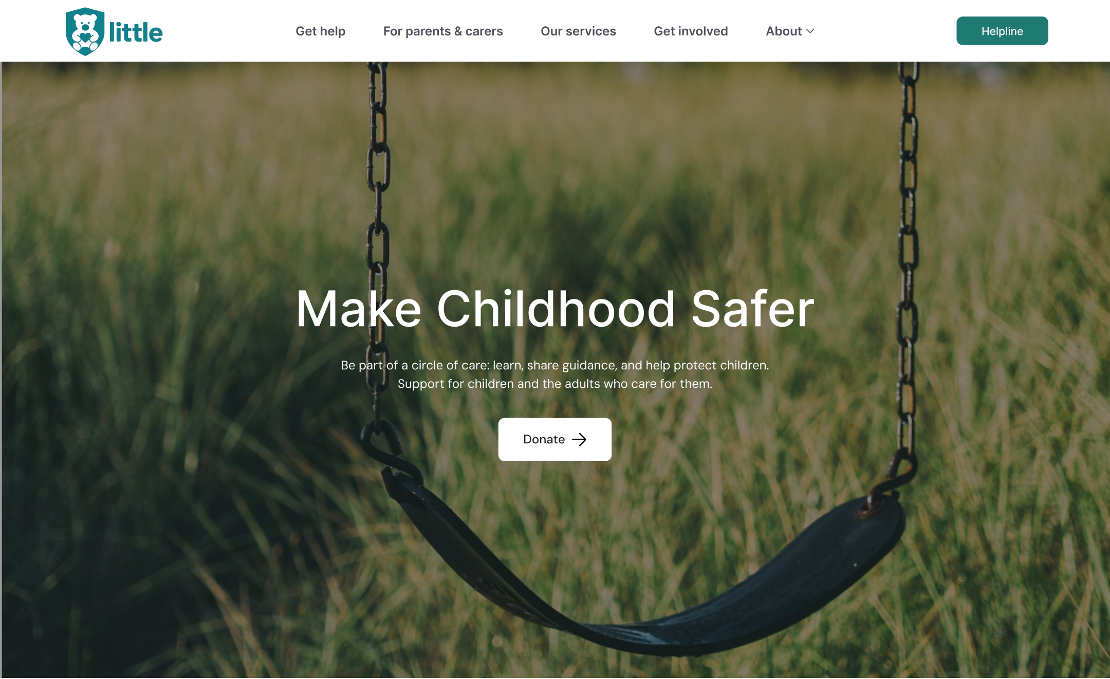
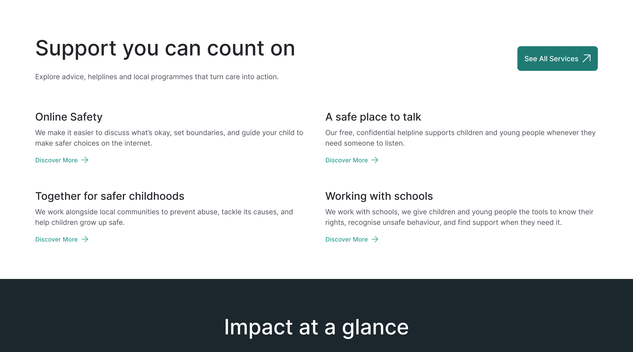
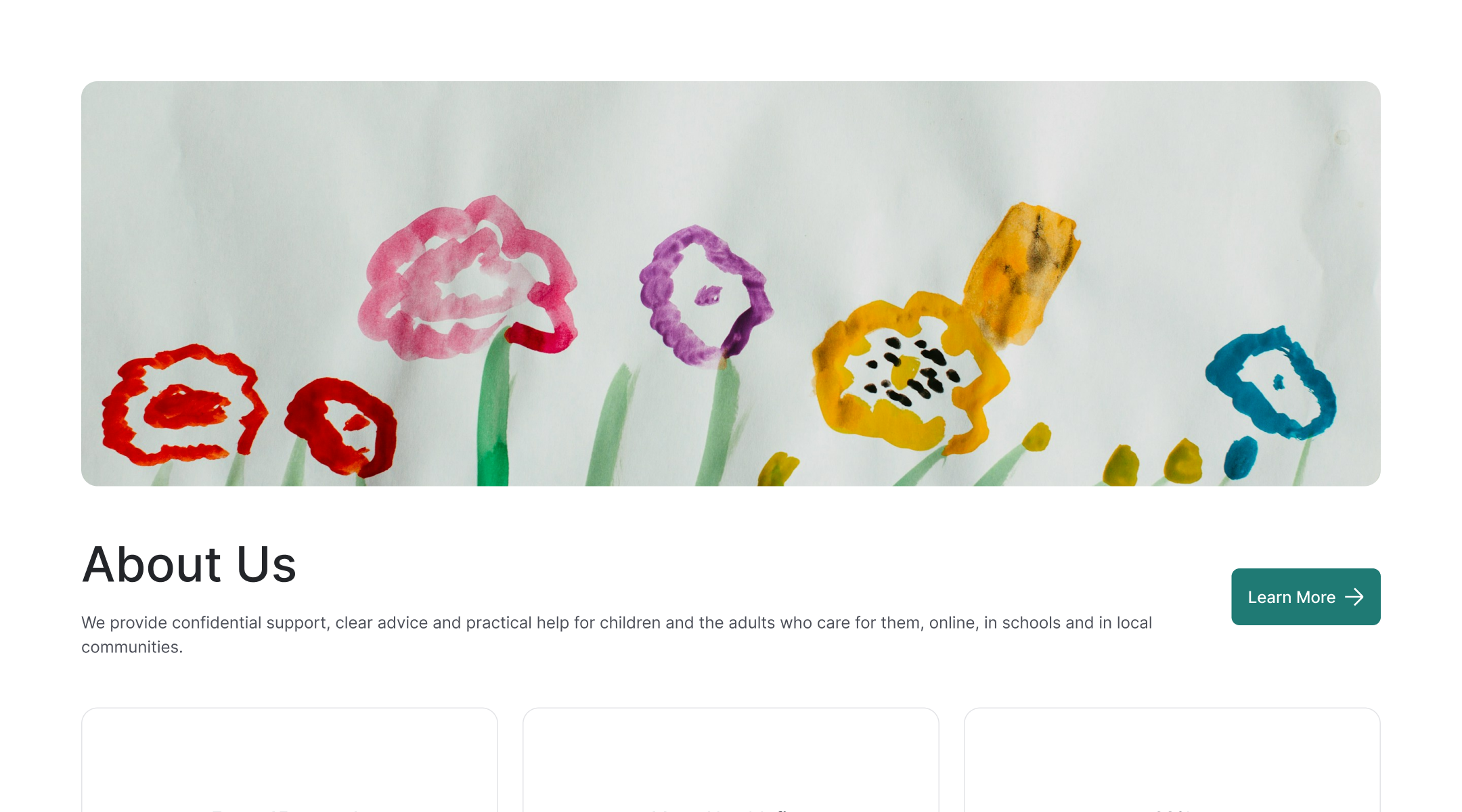
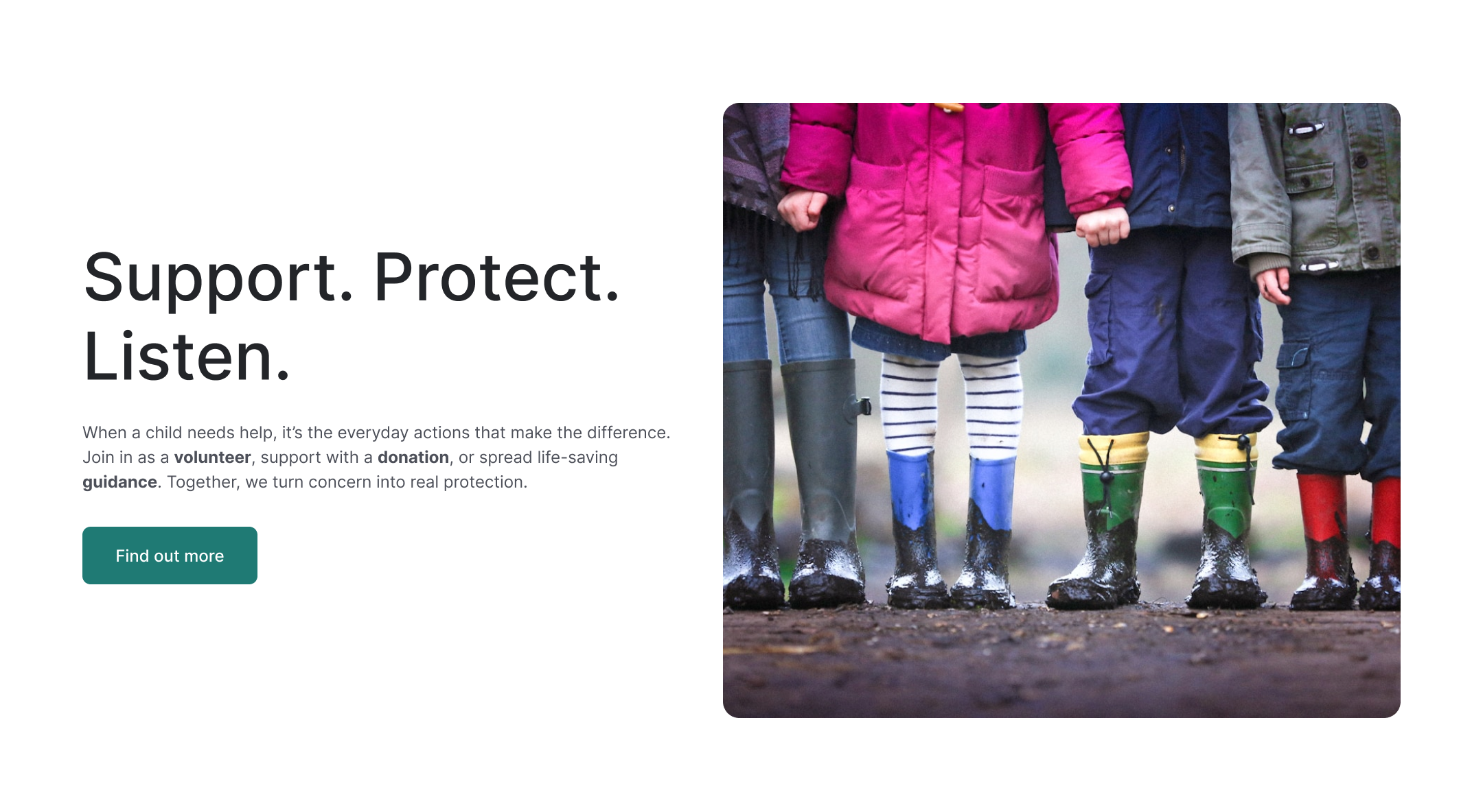
A calmer, single-column narrative that: (1) triages help quickly, (2) establishes trust with proof, and (3) gives a focused set of ways to contribute without burying parents, schools or donors.


Before
After
}
}
}
80
24
80
#1F7A74
#FFFFFF
#1B272C
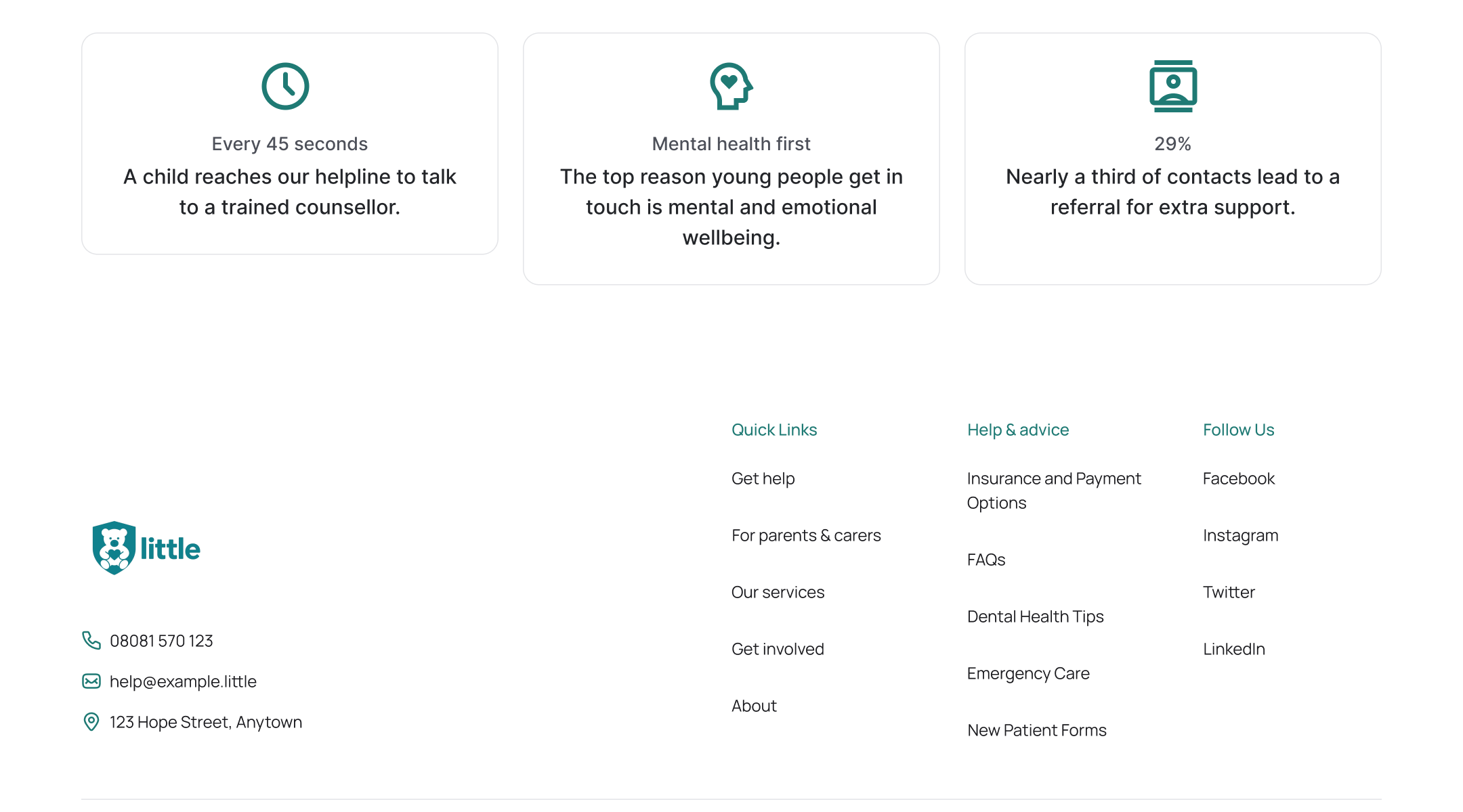
From information-dense nav → To audience-first IA with persistent Donate and priority Get help.
From variable hero readability → To accessible, overlay-based hero.
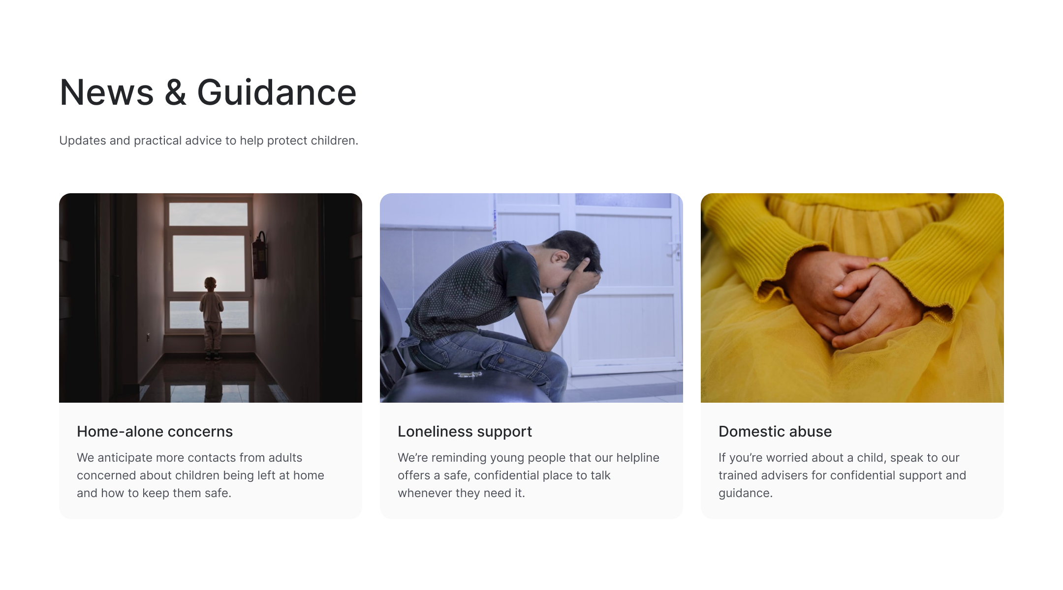
From mixed card patterns → To one reusable card system.
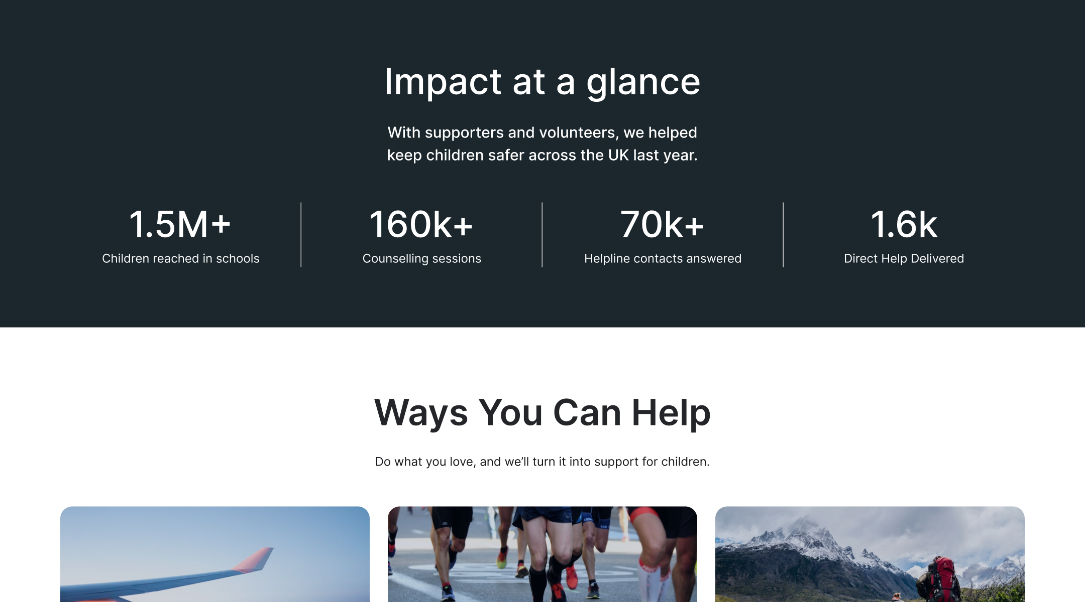
From scattered “help” actions → To a consolidated Ways You Can Help hub.
From long trust copy → To a compact Impact band near the fold.


Thanks for reading.
This project means a lot to me given the mission behind it, and I hope you enjoyed the walkthrough.
(Independent concept; not affiliated with NSPCC.)
Inter
Aa Bb Cc Dd Ee Ff Gg Hh Ii Jj Kk Ll Mm
Nn Oo Pp Qq Rr Ss Tt Uu Vv Ww Xx Yy Zz
1 2 3 4 5 6 7 8 9 0 ! ?
Back to Explorations

little
About the project
Context & problem
Visual Identity
UI overview
What changed


Disclaimer: This is a personal design exercise and is not affiliated with NSPCC. All trademarks and brand assets remain the property of their respective owners. Any figures shown in mockups are illustrative.
NSPCC serves multiple audiences: children in crisis, parents and carers seeking guidance, schools, and supporters. The original homepage has to speak to all of them at once, which can dilute focus. I redesigned the landing page to make urgent help and key actions easier to find while strengthening trust and readability.
Project
Web page
Category
Charity
Project year
2025


Who NSPCC serves


NSPCC speaks to four audiences at once:
- Children & young people who need immediate, safe guidance.
- Parents & carers looking for practical advice.
- Schools & professionals seeking training and safeguarding support.
- Donors & volunteers who fund the mission.
Problems found
- Information-dense navigation made it hard to know where to start.
- Mixed page hierarchies (topics, audiences, and programs all at the same level) blurred decision paths.
- Donation vs. “Get help”: competing primary CTAs created cognitive friction at the very top of the page.
- Inconsistent card patterns (varying ratios, labels, and affordances) slowed scanning.
- Hero image readability/contrast was unreliable depending on photography.
- “How to help” options were scattered across events, fundraising, and volunteering.
Design response
A calmer, single-column narrative that: (1) triages help quickly, (2) establishes trust with proof, and (3) gives a focused set of ways to contribute without burying parents, schools or donors.


Before
After


}
}
}
80
24
80
#1F7A74
#FFFFFF
#1B272C
From information-dense nav → To audience-first IA with persistent Donate and priority Get help.
From variable hero readability → To accessible, overlay-based hero.
From mixed card patterns → To one reusable card system.
From scattered “help” actions → To a consolidated Ways You Can Help hub.
From long trust copy → To a compact Impact band near the fold.


Thanks for reading.
This project means a lot to me given the mission behind it, and I hope you enjoyed the walkthrough.
(Independent concept; not affiliated with NSPCC.)
Inter
Aa Bb Cc Dd Ee Ff Gg Hh Ii Jj Kk Ll Mm
Nn Oo Pp Qq Rr Ss Tt Uu Vv Ww Xx Yy Zz
1 2 3 4 5 6 7 8 9 0 ! ?
Back to Explorations
