January 1, 2025
A Photographer’s Vision
Overview
This project involved designing and building a responsive portfolio website for a photographer whose business was previously promoted only through social media. The website was created to present her work professionally, improve discoverability, and support growth through a stronger online presence.
Role
UX Researcher, UX/UI designer
Toolkit
Figma, Wordpress, FigJam
UX Design
- Project Goals
The project goals were shaped through stakeholder discovery and competitive analysis rather than direct user interviews. To bridge that gap, I relied on recurring patterns found in successful photography websites and typical portfolio user journeys (browse work → build trust → reach out). The main goals of the website are to showcase a curated portfolio by category, communicate the photographer’s identity and offering, improve her online presence outside social platforms, and provide a frictionless path to inquiry via clear calls-to-action.
- Product Roadmap
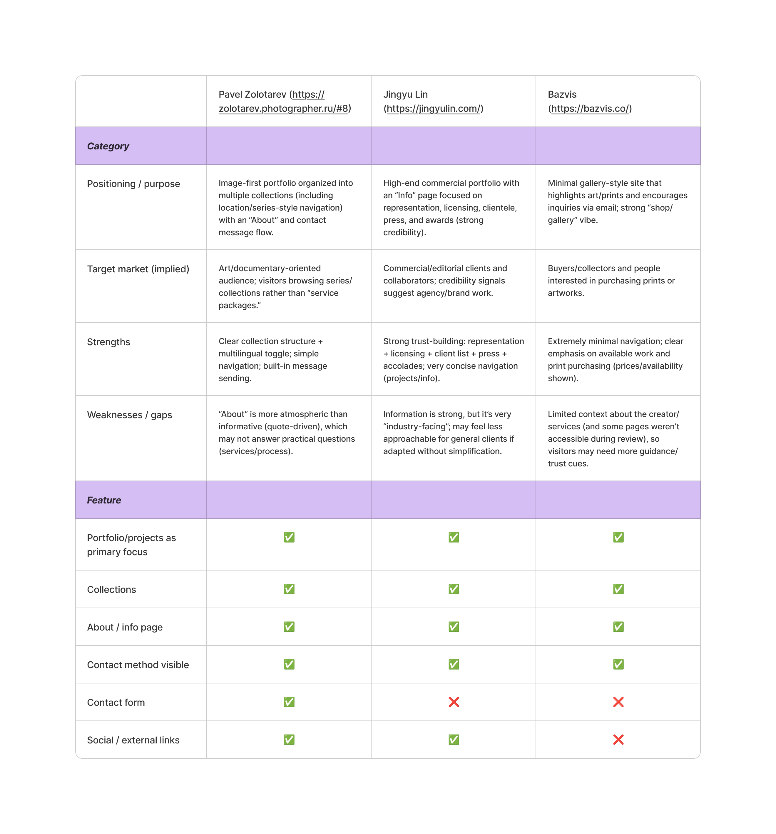
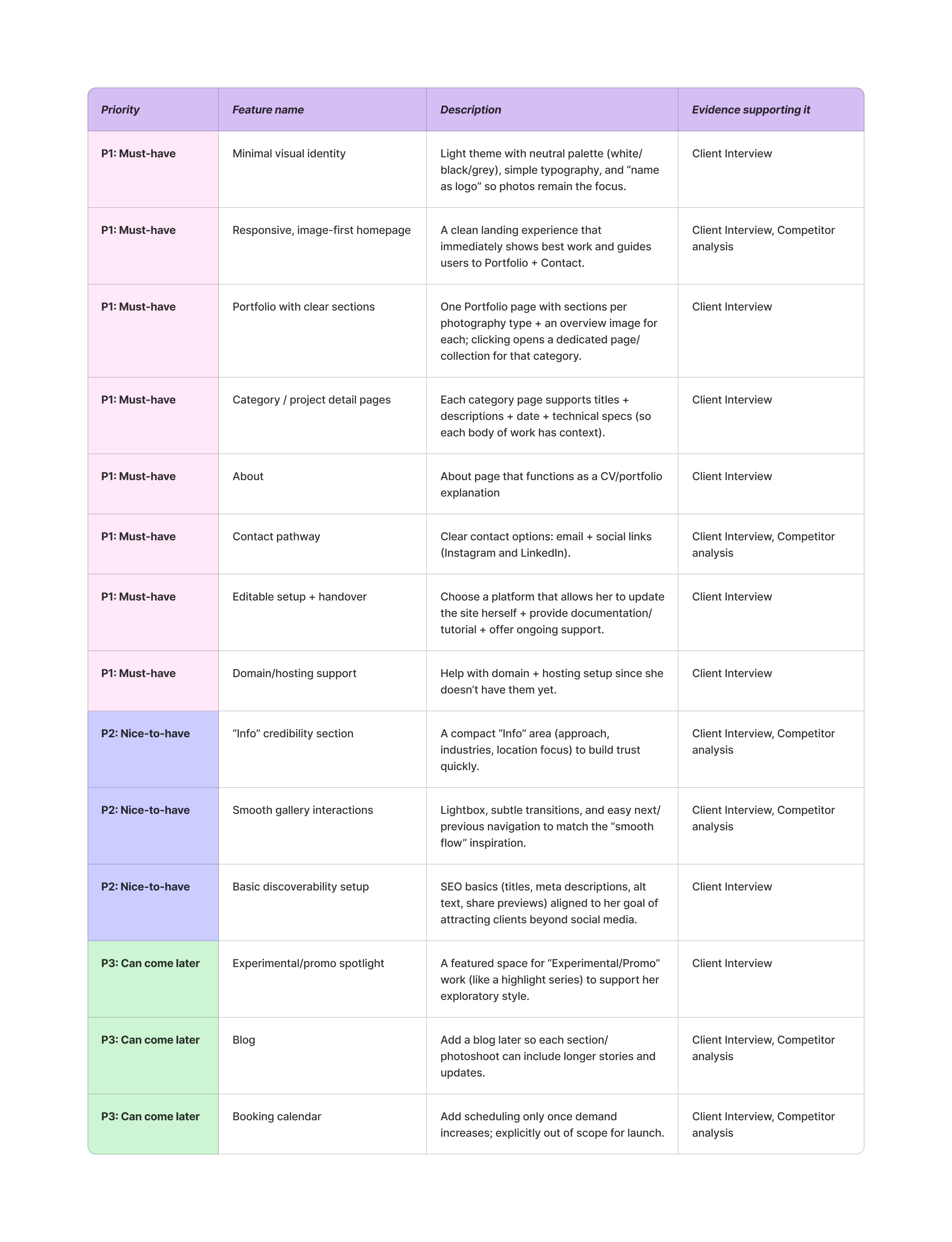
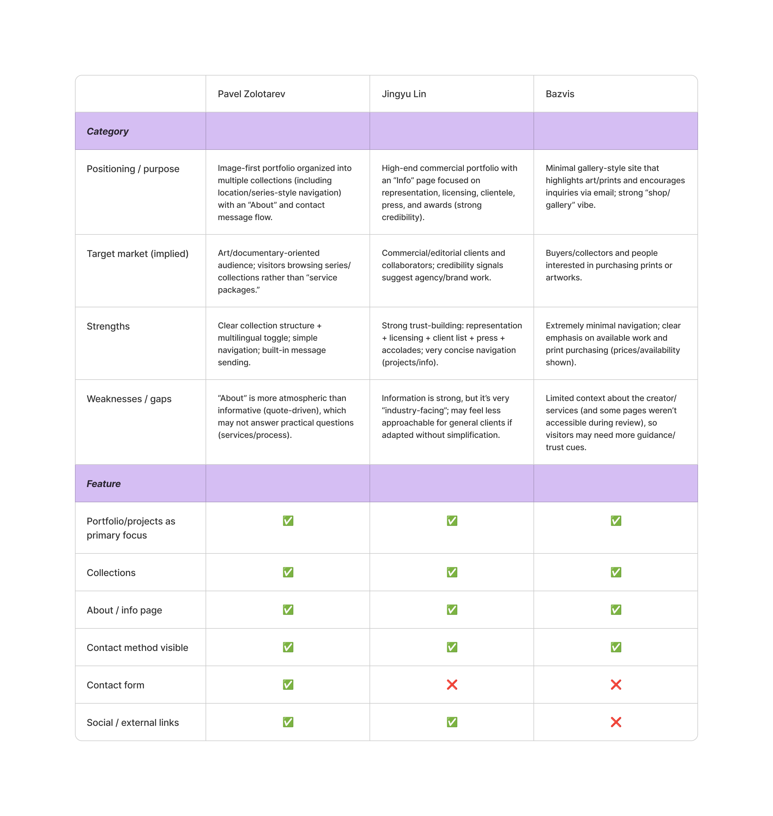
After having established project goals, I’ve listed the different features I wanted to include in the website and then prioritised them into a spreadsheet. All the decisions have been supported by competitive analysis and initial client interview.
UI Design
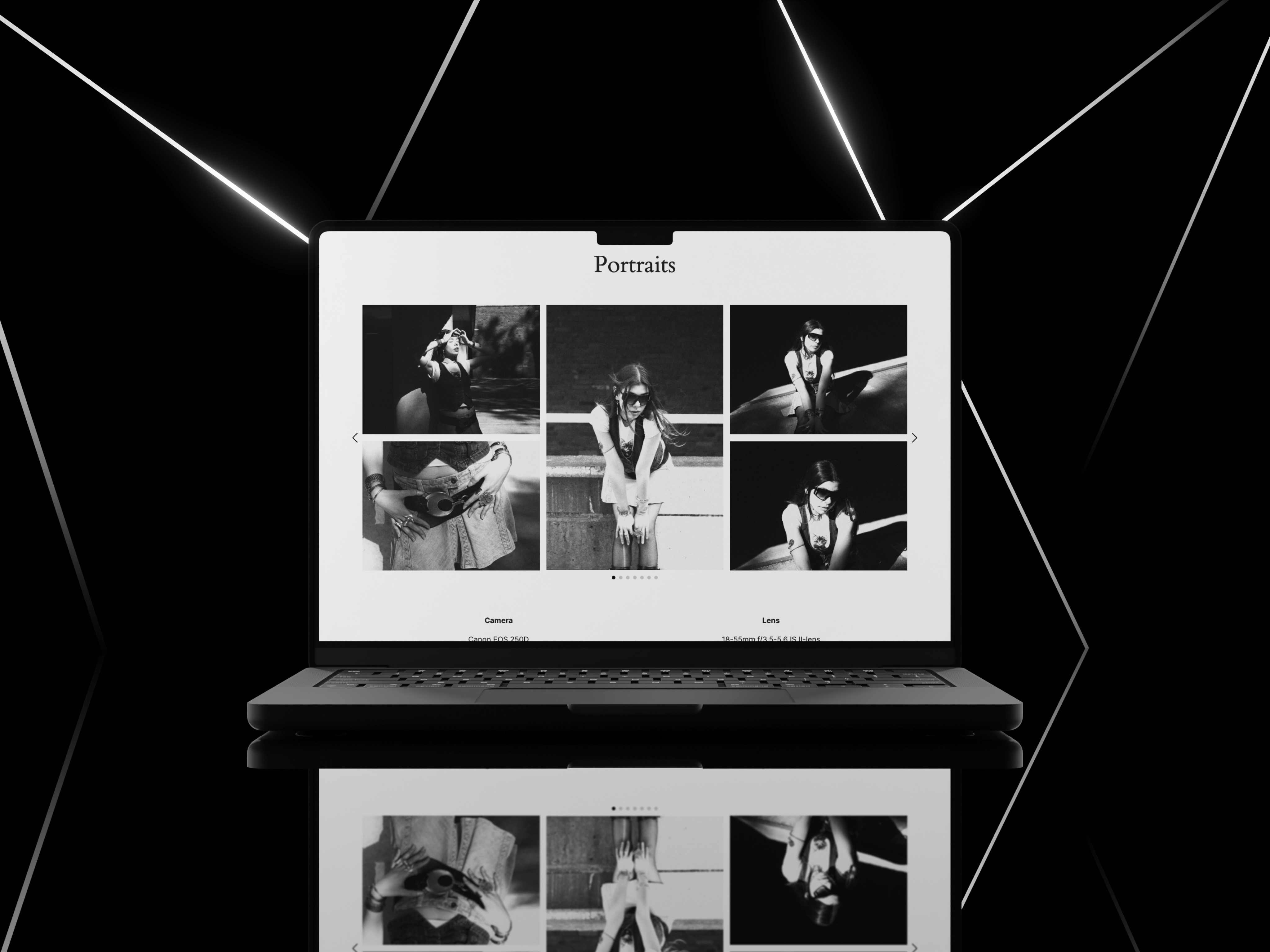
- Prototype & Implementation
I built the final site in Wordpress to simulate a real-world scenario where designers collaborate with developers or use no-code tools. I chose this builder because:
- It allowed full control over layout and styling
- Easy to customize without heavy code
- Fast deployment for testing
Final Takeaways
- Challenges
Working with a real client meant constant alignment and clear expectations. The first interview with the photographer was crucial because it defined the direction of the project (her goals, priorities, and constraints) and it gave me the right angle for my UX work. I relied on her input and competitor benchmarking to validate structure and features, and I kept decisions transparent through regular check-ins so she always knew what was being built and why.
Another challenge was translating the ideal design into what was realistically achievable within the chosen platform and plan. Some layout and functionality choices had to be simplified or adjusted to fit WordPress limitations, especially on a lower-tier subscription. This required prioritising what mattered most for launch, finding workarounds where possible, and agreeing with the client on what could be improved later through upgrades or future iterations.
- Tool Criticism
For this project, WordPress.com was a good fit because it’s quick to launch, easy for the client to maintain, and includes managed hosting and built-in site features. However, the lowest paid plan (Personal) comes with trade-offs that shaped what we could realistically deliver at launch. Storage is limited (6 GB), which can become a constraint for a photography-heavy portfolio if lots of high-resolution images are uploaded. In addition, some “professional growth” features are gated behind higher tiers such as connecting Google Analytics (Premium+), more advanced stats (UTM/device insights via Premium+), video uploads (Premium+). Design flexibility also has limits depending on plan level (for example, certain partner themes require higher plans), and while plugin installs are supported, some plugins are restricted on WordPress.com.
All of these constraints and the options to upgrade later if needed were discussed openly with the client before committing to the build. Every key decision (platform choice, plan level, and scope) was made with her approval so she would be fully aware of the limitations and what was in or out of scope for the first release.
- Wins
One of the biggest wins was finding the right balance between a clean, easy-to-navigate UX and the client’s need for visual storytelling, keeping the interface minimal so the photography stays central, while still guiding visitors clearly through the portfolio and toward contact. Another win was getting hands-on experience designing within a real platform (WordPress), adapting the design to real constraints instead of staying in “perfect mockup” territory. Finally, working with a real client strengthened my communication and decision-making process: aligning on priorities, documenting choices, and making sure the final result reflected her goals at every step.
- Information Architecture
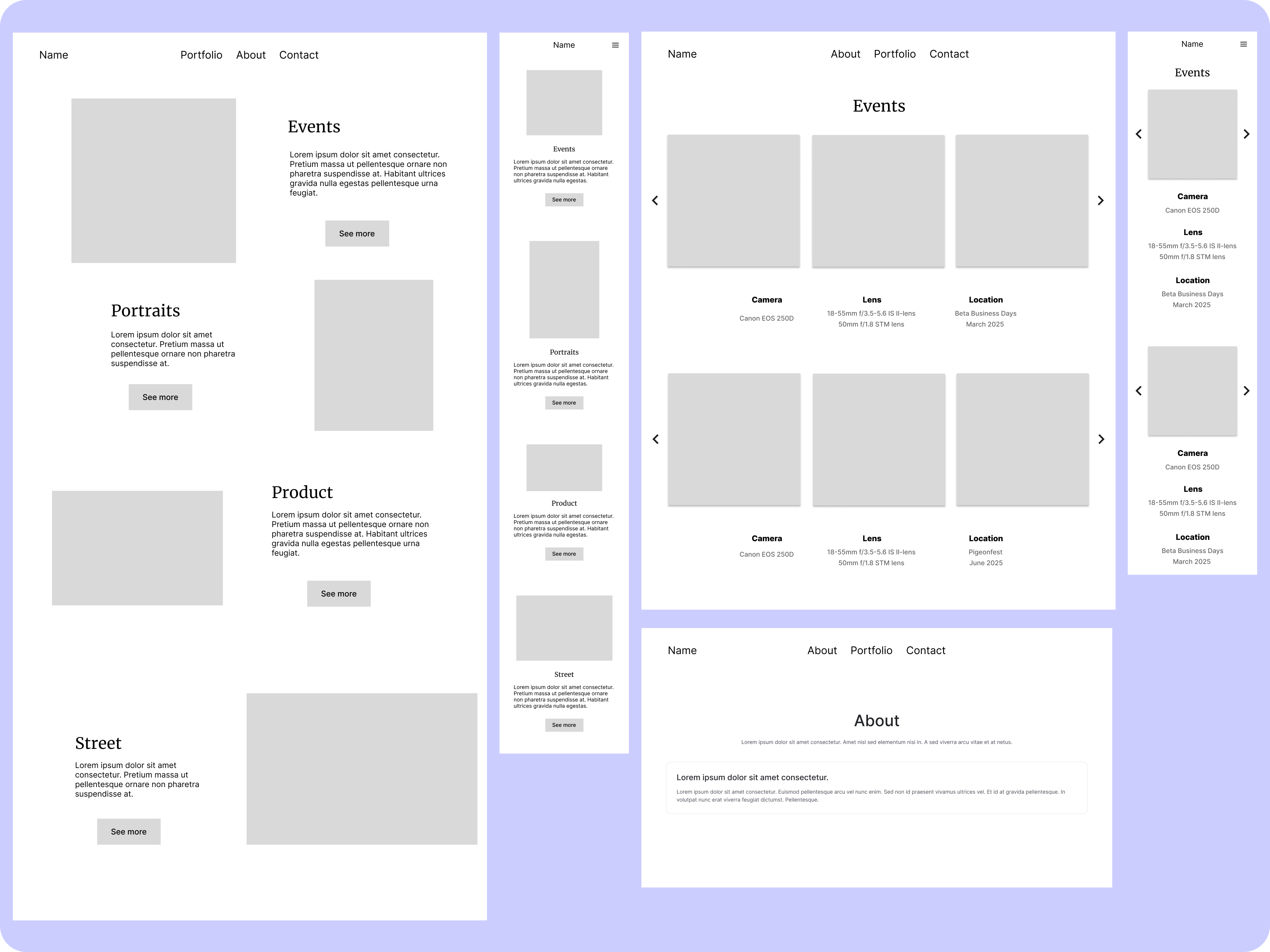
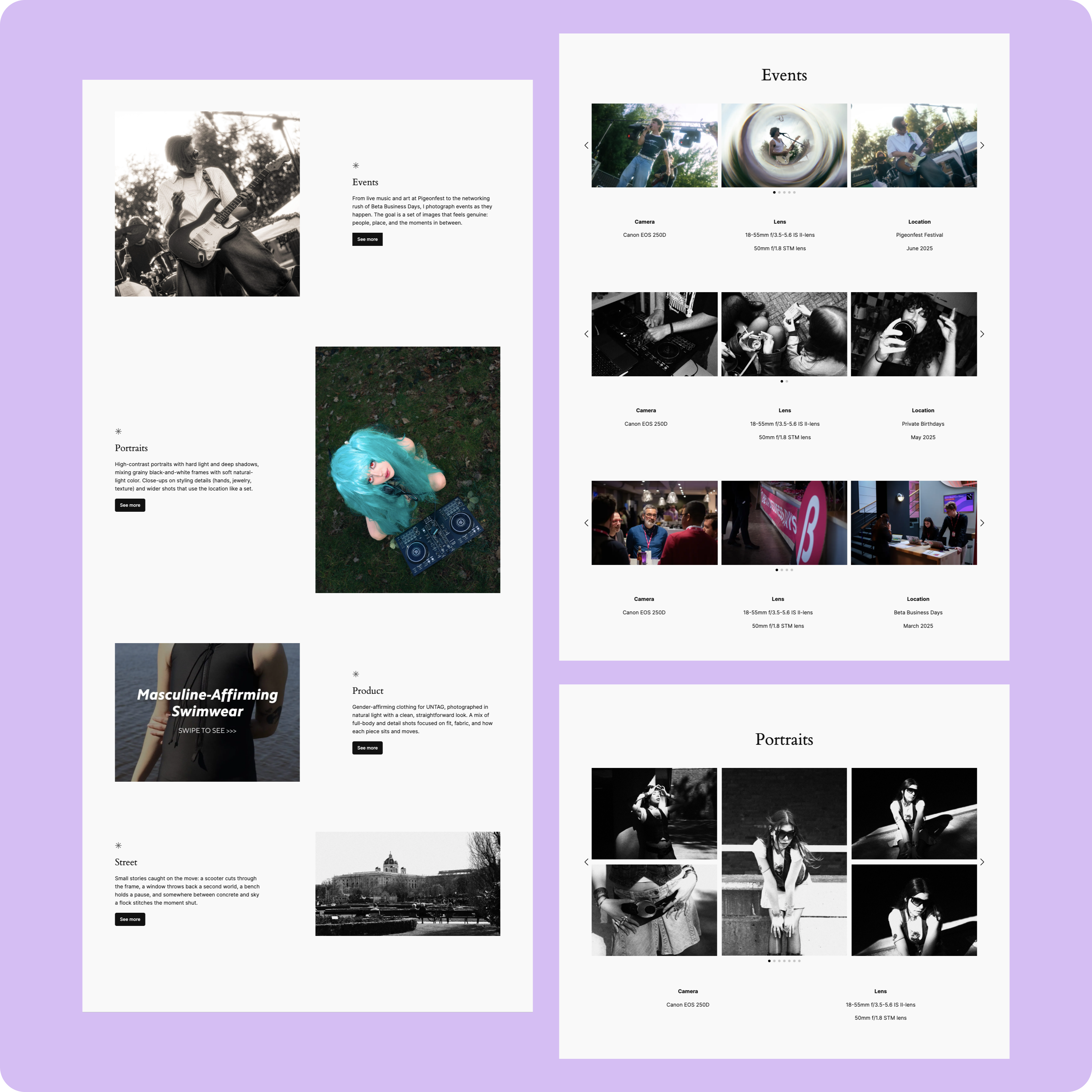
I kept the sitemap intentionally minimal: Home, Portfolio, About, and Contact. The homepage works as the main container for discovery, showing portfolio section previews and guiding users into the work. The Portfolio is the central hub, presented as a toggle list that lets visitors jump straight to one of four categories, each with its own dedicated gallery page. About and Contact remain simple and easy to find to support trust and enquiries.
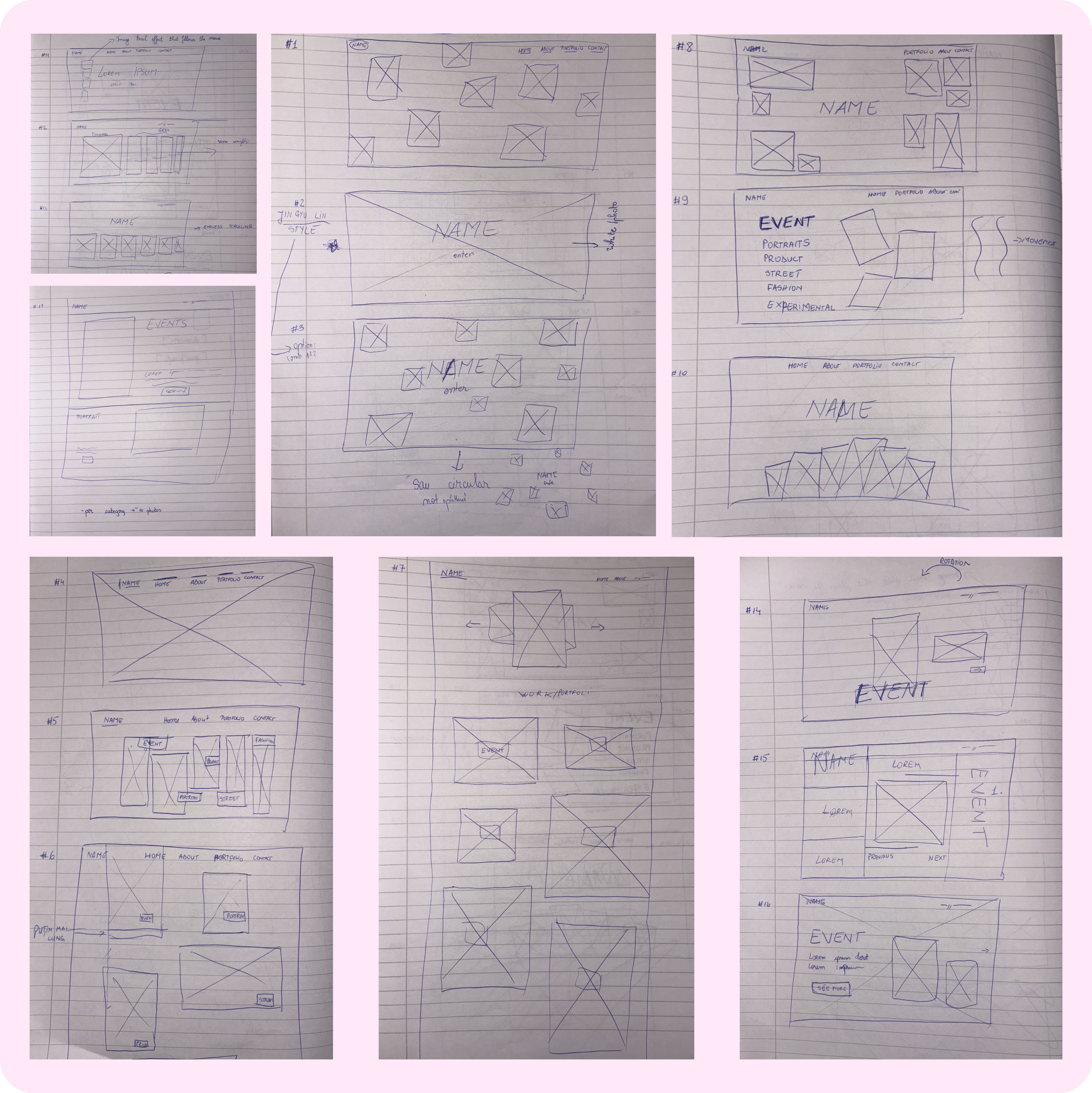
- Exploring
After setting all users needs, information architecture, I’ve explored a few ideas by sketching some of the main features. In this phase, I’ve also started thinking about the style of graphics I wanted to achieve.
- Wireframes
With the help of sitemap, I’ve started building my low-fidelity wireframes.
- Research Goals
Understand the photographer’s business goals and audience needs in order to define the site structure, visual direction, and key content that supports discoverability and inquiries.
UX Research
- Client Interview
I began the project with an initial discovery interview to understand the photographer’s goals, brand direction, and content needs. She already had a clear visual preference for a minimalist look, primarily white, black, and grey, so the photography stays the main focus. She also wanted the website to be structured into distinct sections, making it easy for visitors to navigate by type of work.
After this conversation, I created a client brief to document the project scope and align expectations. The brief includes her objectives, audience, desired pages/structure, visual preferences, and functional requirements.
Key insights from the interview:
- Primary goal: A portfolio-focused website to showcase work and attract clients (with potential to add a blog later).
- Visual direction: Light theme; neutral palette (white/black/grey), simple typography; no logo, just her name in a clean font.
- Content & structure: Core pages: Home, About, Portfolio, Contact. Portfolio to include clear categories (e.g., portraits, fashion, product, events, street), with each section supported by titles and short descriptions.
- Functionality: Contact via email + social links (Instagram and LinkedIn). Booking/calendar is a possible future addition.
- Practical needs: She wanted to be able to update the site herself and requested documentation/support after launch.