SERVICE
FOR
DATE
App UI/UX
Daily UI Challenge
July 29th
Splash & Onboarding
#023
6 hours
About
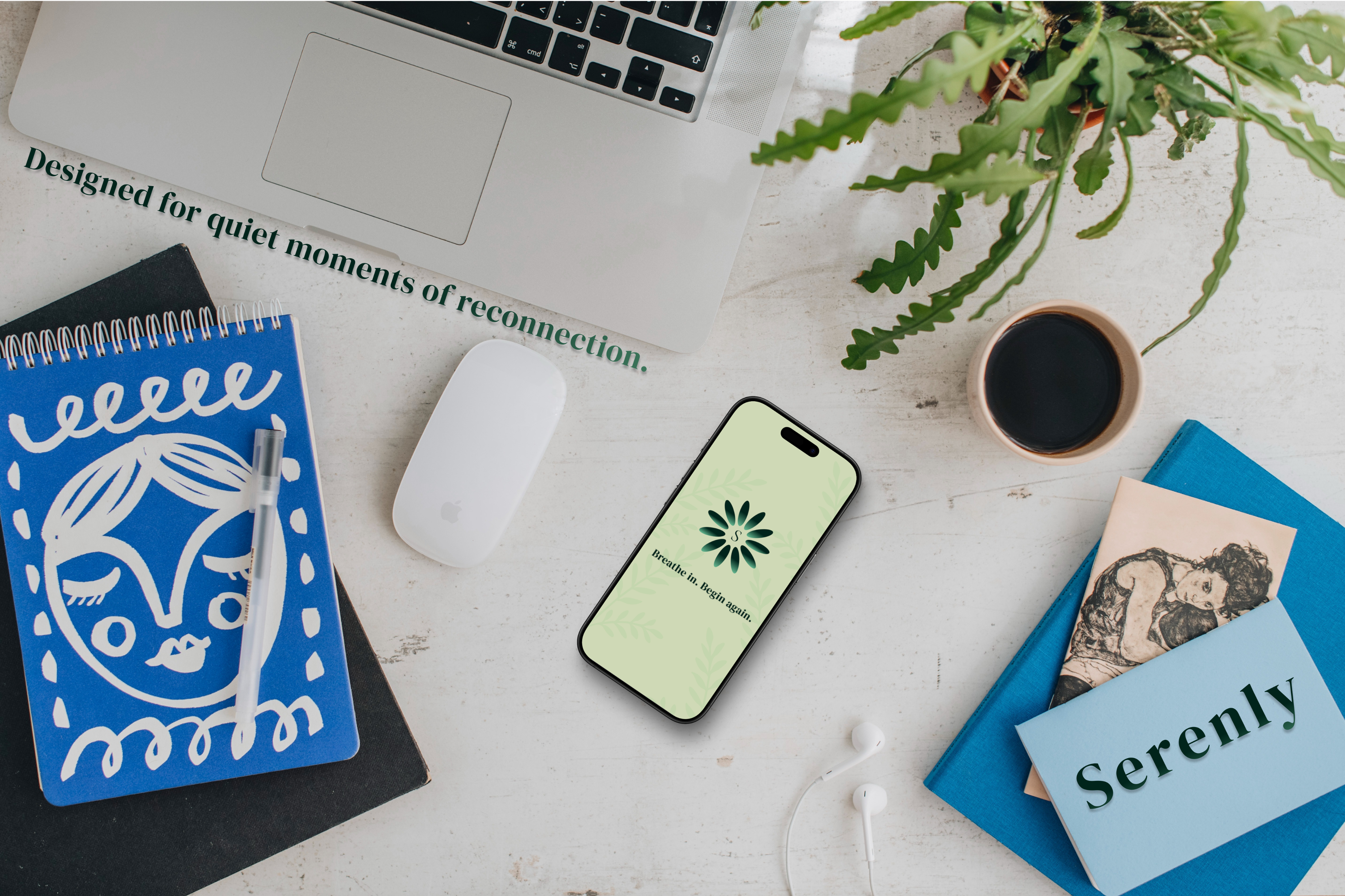
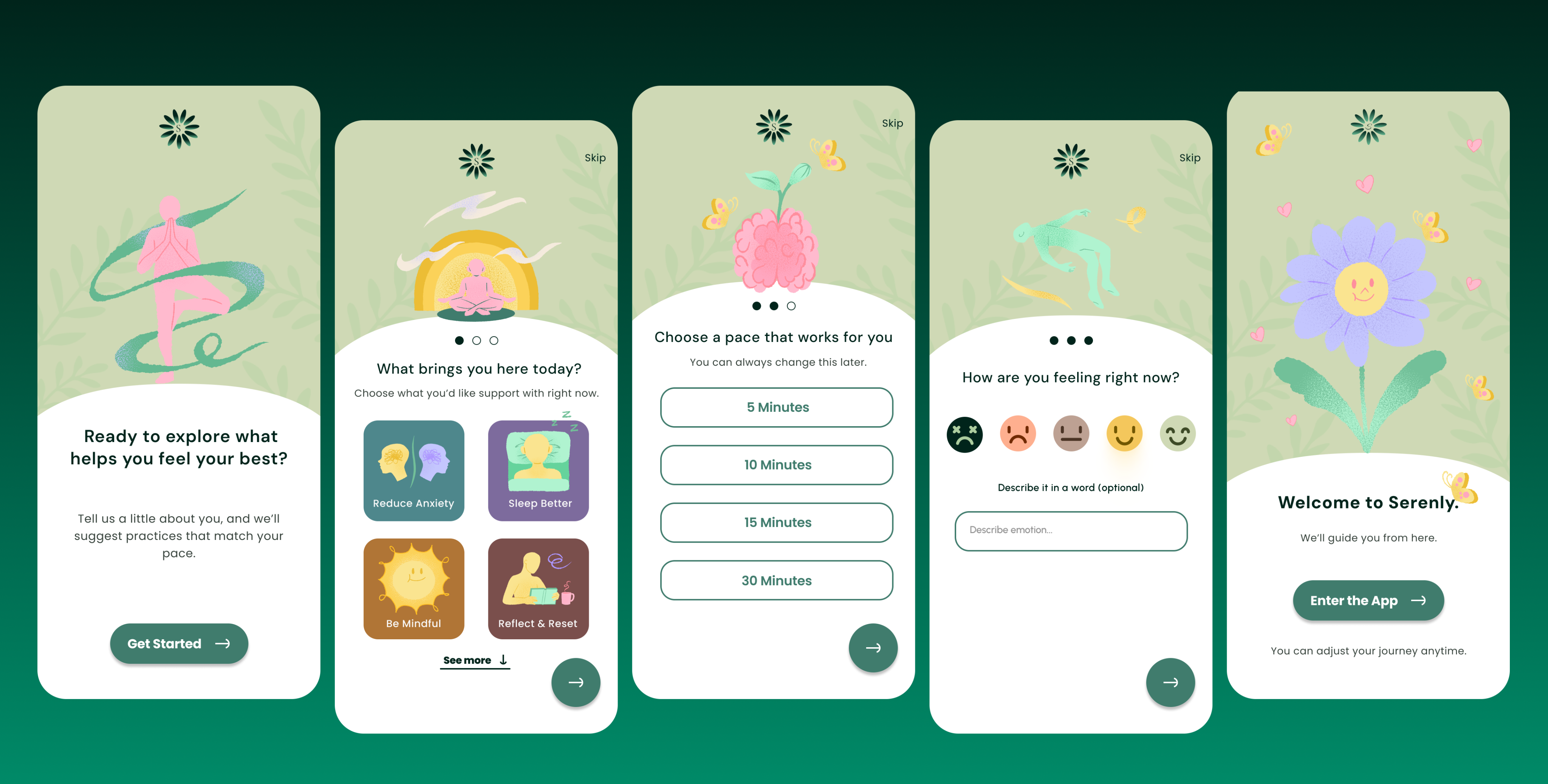
Serenly is a conceptual wellness app designed as part of the Daily UI Challenge #023, with a focus on crafting an emotionally supportive onboarding experience.
The goal was to create a calm, welcoming flow that helps users ease into self-care without pressure or clinical overtones. The onboarding screens were thoughtfully designed to feel personal, intuitive, and grounded in softness.
I led the UX strategy, information architecture, UI design, typography, colour system, and microcopy. While the illustrations are sourced, they were carefully curated and integrated to complement the serene experience.
Are you recruiting people for an organization? Are people signing up for a new service or website? Is it welcoming people into a mobile app?
Onboarding might seem trivial, but it's the first experience your users have with your product or service. It's like the first page of a book and it can instantly excite them. If not implemented well, a bad onboarding experience could turn someone off of a brand completely.
PROMPT
#00241B
#7D6B9D
#36423B
#FAE490
#407C6D
#FFBACE
#CFD9B5
#FFFFFF
Colour & Typography
The colour palette for Serenly was intentionally chosen to evoke calm, clarity, and emotional safety, which are key goals in any wellness-oriented experience. Shades of green (#00241B, #36423B, #407C6D) serve as the foundation, representing nature, restoration, and grounding energy. These hues have been shown to foster a sense of balance and tranquillity, making them especially effective for mental wellness tools (Eriksen, 2024).
Soft lilac (#7D69BD) and blush pink (#FFBACE) add gentle emotional resonance, supporting reflection and kindness, while pastel yellow (#FAE490) introduces subtle optimism without overwhelming stimulation. White (#FFFFFF) is used to reinforce clarity, legibility, and spaciousness, offering a visual breath between content and action. This carefully curated palette aligns with the emotional needs of users seeking mindful digital spaces and reflects current best practices in colour use for health and wellness design.
Is a clean, geometric sans serif designed for legibility at small sizes and strong performance across digital interfaces. Its neutral tone and wide spacing make it highly effective for body text and general UI use, ensuring a calm and readable user experience (Figma Fonts, Figma Resource Library).
A geometric sans serif with rounded letterforms, was chosen for action elements such as buttons and navigational text. Its uniform stroke weight and visual balance give it a friendly and modern tone, supporting usability while keeping the interface approachable (Vocal, Typogram).
Is used selectively for larger text moments, like onboarding headlines or emotionally expressive statements. Its contrast and elegance provide visual warmth, creating a human-centred rhythm between function and feeling. When paired with sans serifs, it establishes hierarchy without overpowering the calm tone of the interface.
The goal was to create an onboarding experience that felt gentle and emotionally safe. I wanted to avoid clinical or overly corporate patterns and instead focus on warmth, space, and clarity. The flow was intentionally short, with emotionally intelligent microcopy and illustrations that reflect softness and self-care.
This project helped me better understand how emotional tone and UX intersect. I learned to design not just for usability, but for feeling. Typography, white-space, and voice all contribute to trust in subtle but powerful ways. If I expanded this project, I would prototype the interaction states and explore more inclusive personalization options.
Aa
Bb
Cc
DM Sans
Poppins
DM Serif Display
Eriksen, M. (2024, July 22). Leveraging the psychology of color in UX design for health and wellness apps :: UXMatters. UXmatters. https://www.uxmatters.com/mt/archives/2024/07/leveraging-the-psychology-of-color-in-ux-design-for-health-and-wellness-apps.php#:~:text=Blue%20calms%20people%20down%2C%20which,fitting%20for%20mental%2Dhealth%20tools
DM SANS
POPPINS
DM SERIF DISPLAY
Goals
Reflection
Back to Explorations

