Primary Colour Palette
#333333
#F7F7F7
#F7F3EC
#234D38
#22C574
#2B7A4B
Aa
Aa
Montserrat is a geometric sans-serif font with a bold, modern structure. Its clean curves and sharp edges help create a strong visual hierarchy which is perfect for guiding the user’s attention to key actions and titles. The font’s clarity and presence make it ideal for mobile interfaces where space is limited and emphasis matters.
Aa Bb Cc Dd Ee Ff Gg Hh Ii Jj Kk Ll Mm
Nn Oo Pp Qq Rr Ss Tt Uu Vv Ww Xx Yy Zz
1 2 3 4 5 6 7 8 9 0 ! ?
Aa Bb Cc Dd Ee Ff Gg Hh Ii Jj Kk Ll Mm
Nn Oo Pp Qq Rr Ss Tt Uu Vv Ww Xx Yy Zz
1 2 3 4 5 6 7 8 9 0 ! ?
Lato, used for paragraph content and form labels, is a versatile sans-serif font designed for high readability. With its slightly rounded letterforms and balanced proportions, Lato provides a friendly and approachable tone that complements the boldness of Montserrat. It performs well across different screen sizes and maintains excellent legibility at smaller font sizes.
Typography
Typography plays a key role in creating a clear, approachable user experience. For this project, I selected Montserrat for headings and call-to-action, and Lato for body text and supporting labels.
Montserrat
Lato
Goals & Reflection
Goals
Reflection
- Create a clean and accessible auth flow for mobile
- Practice using colour and typography intentionally
- Add personality without overwhelming function
- As someone at the beginning of my design journey, this project was a great opportunity to explore structure, visual clarity, and user-focused design. I challenged myself to keep the layout clean, the interactions intuitive, and the overall experience cohesive.
- The challenge helped me sharpen my attention to spacing, hierarchy, and accessibility. These are elements that are easy to underestimate but critical to good UI.
- I also experimented with a more expressive landing screen, which encouraged me to think visually beyond basic form inputs. It was a valuable exercise in balancing creativity with usability.


Discover the World
Join our adventures
Sign up
Sign in
Get Started
Enter Full Name
Full Name
Enter Email
Password
Enter Password
I agree to the processing of Personal Data
Sign up
Already have an account? Sign in
Sign up with
Welcome Back
alexandra@baladesign.com
Password
Remember me
Forgot password?
Sign in
Don’t have an account? Sign up
Sign in with
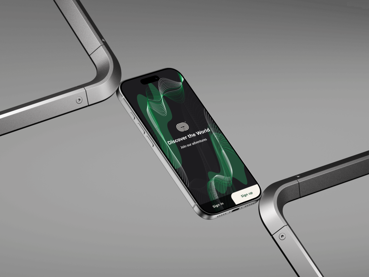
As part of the Daily UI Challenge, I designed a high-fidelity sign-up interface emphasizing usability, visual hierarchy, and aesthetic consistency. The design explores a modern, tech-driven look through a dark theme accented with vibrant green tones to convey energy and innovation. I established a structured color palette and a clear typography system using Montserrat for headings and Lato for body text, ensuring readability and visual balance. The result is a cohesive and accessible experience that effectively guides users through the onboarding process with clarity and intent.
Back to Explorations

Primary Colour Palette
#333333
#F7F7F7
#F7F3EC
#234D38
#22C574
#2B7A4B
Aa
Aa
Montserrat is a geometric sans-serif font with a bold, modern structure. Its clean curves and sharp edges help create a strong visual hierarchy which is perfect for guiding the user’s attention to key actions and titles. The font’s clarity and presence make it ideal for mobile interfaces where space is limited and emphasis matters.
Aa Bb Cc Dd Ee Ff Gg Hh Ii Jj Kk Ll Mm
Nn Oo Pp Qq Rr Ss Tt Uu Vv Ww Xx Yy Zz
1 2 3 4 5 6 7 8 9 0 ! ?
Aa Bb Cc Dd Ee Ff Gg Hh Ii Jj Kk Ll Mm
Nn Oo Pp Qq Rr Ss Tt Uu Vv Ww Xx Yy Zz
1 2 3 4 5 6 7 8 9 0 ! ?
Lato, used for paragraph content and form labels, is a versatile sans-serif font designed for high readability. With its slightly rounded letterforms and balanced proportions, Lato provides a friendly and approachable tone that complements the boldness of Montserrat. It performs well across different screen sizes and maintains excellent legibility at smaller font sizes.
Typography
Typography plays a key role in creating a clear, approachable user experience. For this project, I selected Montserrat for headings and call-to-action, and Lato for body text and supporting labels.
Montserrat
Lato
Goals & Reflection
Goals
Reflection
- Create a clean and accessible auth flow for mobile
- Practice using colour and typography intentionally
- Add personality without overwhelming function
- As someone at the beginning of my design journey, this project was a great opportunity to explore structure, visual clarity, and user-focused design. I challenged myself to keep the layout clean, the interactions intuitive, and the overall experience cohesive.
- The challenge helped me sharpen my attention to spacing, hierarchy, and accessibility. These are elements that are easy to underestimate but critical to good UI.
- I also experimented with a more expressive landing screen, which encouraged me to think visually beyond basic form inputs. It was a valuable exercise in balancing creativity with usability.


Discover the World
Join our adventures
Sign up
Sign in
Get Started
Enter Full Name
Full Name
Enter Email
Password
Enter Password
I agree to the processing of Personal Data
Sign up
Already have an account? Sign in
Sign up with
Welcome Back
alexandra@baladesign.com
Password
Remember me
Forgot password?
Sign in
Don’t have an account? Sign up
Sign in with
As part of the Daily UI Challenge, I designed a high-fidelity sign-up interface emphasizing usability, visual hierarchy, and aesthetic consistency. The design explores a modern, tech-driven look through a dark theme accented with vibrant green tones to convey energy and innovation. I established a structured color palette and a clear typography system using Montserrat for headings and Lato for body text, ensuring readability and visual balance. The result is a cohesive and accessible experience that effectively guides users through the onboarding process with clarity and intent.
Back to Explorations