
UI/UX Design
Weather app




Overview
Typography
Colour
Reflection
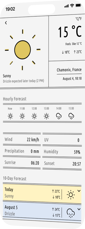
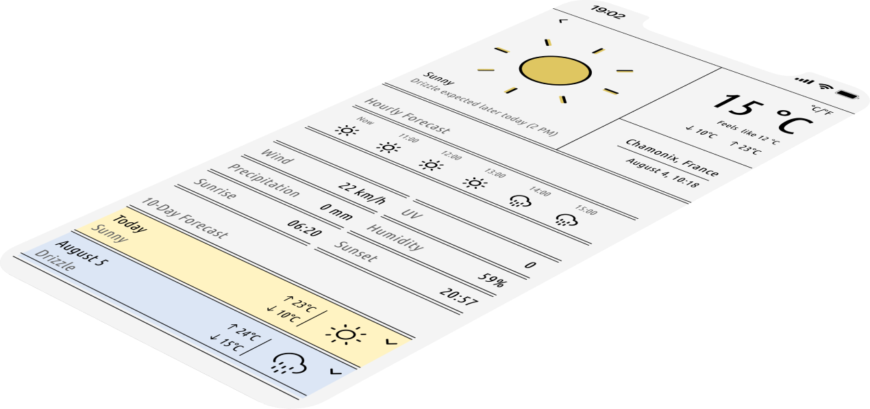
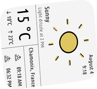
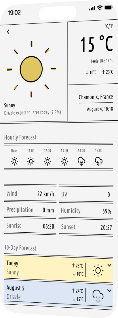
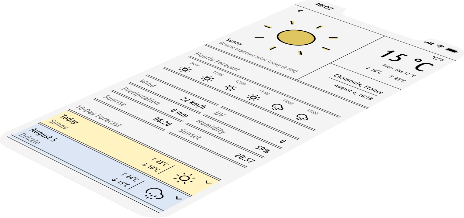
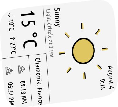
This design was created as part of the DailyUI challenge. The goal was to build a weather app interface that is both user-centred and visually engaging, with special attention to clarity, accessibility, and responsive layout.
Designing this weather app was an opportunity to explore the balance between clarity, aesthetics and functionality. I challenged myself to remain minimal while still creating an emotionally engaging experience through colour and layout.
One key takeaway was realising how important typography and spacing are when working with limited font weights, such as Ubuntu Condensed. Creating the smartwatch companion version also taught me the importance of glanceable design, and how to prioritise and simplify without losing meaning.
Weather apps often prioritise functionality over visual experience, resulting in interfaces that are dense, uninspiring, or overwhelming. Additionally, few designs provide strong day/night support or emphasise visual hierarchy in a user-friendly way.
- Design a weather app interface that is clean, emotionally engaging, and easy to navigate.
- Introduce visual contrast between different weather conditions without compromising clarity.
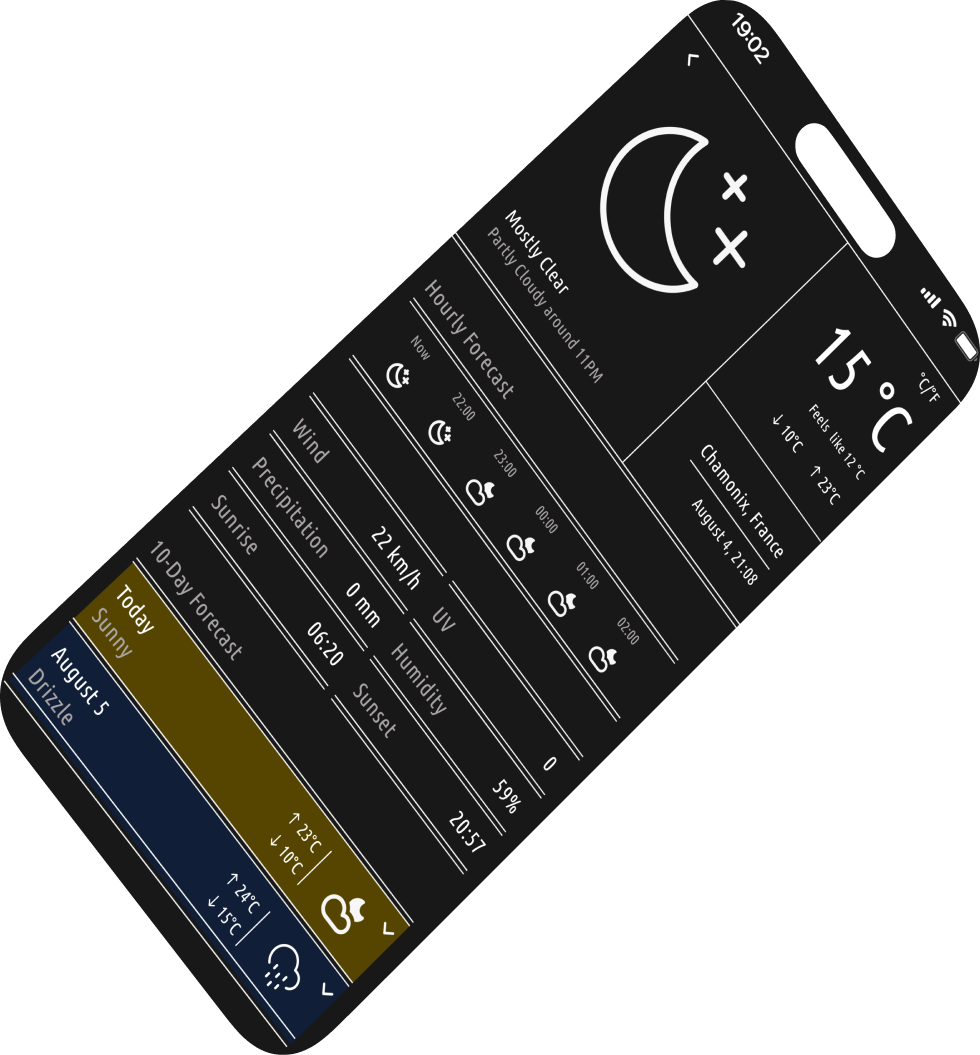
- Ensure accessibility and readability across day and night modes.
- Stand out by using thoughtful colour, typography, and iconography while respecting UX best practices.
Problem
Goals
Aa Bb Cc Dd Ee Ff Gg Hh Ii Jj Kk Ll Mm
Nn Oo Pp Qq Rr Ss Tt Uu Vv Ww Xx Yy Zz
1 2 3 4 5 6 7 8 9 0 ! ?
FONT
Ubuntu Condensed
#FFF3C2
#DFC661
#DCE6F5
#101F37
#F4F4F4
#616161
#181818
Thanks for scrolling!



Back to Explorations

UI/UX Design
Weather app




Overview
Typography
Colour
Reflection
This design was created as part of the DailyUI challenge. The goal was to build a weather app interface that is both user-centred and visually engaging, with special attention to clarity, accessibility, and responsive layout.
Designing this weather app was an opportunity to explore the balance between clarity, aesthetics and functionality. I challenged myself to remain minimal while still creating an emotionally engaging experience through colour and layout.
One key takeaway was realising how important typography and spacing are when working with limited font weights, such as Ubuntu Condensed. Creating the smartwatch companion version also taught me the importance of glanceable design, and how to prioritise and simplify without losing meaning.
Weather apps often prioritise functionality over visual experience, resulting in interfaces that are dense, uninspiring, or overwhelming. Additionally, few designs provide strong day/night support or emphasise visual hierarchy in a user-friendly way.
- Design a weather app interface that is clean, emotionally engaging, and easy to navigate.
- Introduce visual contrast between different weather conditions without compromising clarity.
- Ensure accessibility and readability across day and night modes.
- Stand out by using thoughtful colour, typography, and iconography while respecting UX best practices.
Problem
Goals
Aa Bb Cc Dd Ee Ff Gg Hh Ii Jj Kk Ll Mm
Nn Oo Pp Qq Rr Ss Tt Uu Vv Ww Xx Yy Zz
1 2 3 4 5 6 7 8 9 0 ! ?
FONT
Ubuntu Condensed
#FFF3C2
#DFC661
#DCE6F5
#101F37
#F4F4F4
#616161
#181818
Thanks for scrolling!





Back to Explorations
